I grew up in a rural neighborhood designed for 60+ homes but the developer went bankrupt after building just two houses. It was just our family’s house for many years, with roads all around that nobody lived on. It kind of turned into a personal racetrack for my brothers and me to ride bikes on.
However, our nearest neighbors through the woods were meth houses, which, as you might imagine, came with pros and cons.
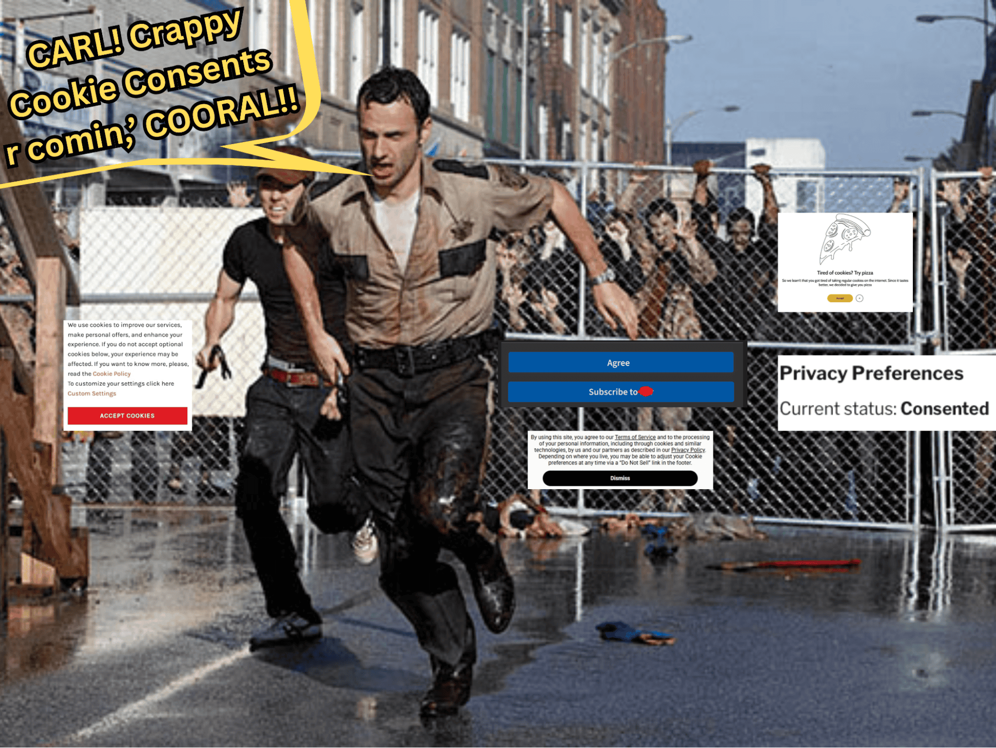
Con: Extras from The Walking Dead would occasionally walk out of the woods.
Pros: This would motivate us to set personal best lap times around our neighborhood track, and it allowed my parents to teach us a valuable lesson:
Never judge a book by its cover. Unless that book is on meth, then you should probably just run.
Now that I work in privacy, I’m still using that same advice. Just with a few tweaks:
Never judge a website by its cover. Unless that website has a crappy Cookie Consent Banner, then you should probably just run.

So, in the spirit of not judging things unless they’re trippin,’ I went hunting for some of the sketchiest cookie banners I could find.
Below are some real-world examples (plus AI’s interpretation of the world’s worst banner at the end) of questionable cookie consent UX, along with what each one gets right and wrong.
Some are bad from a design perspective. Some are bad from a user-experience perspective. Some raise potential compliance concerns when it comes to the laws that require a Cookie Consent Banner.
And some are just… impressively terrible.
Example 1: Pizza and Puns

I thought this was a pretty decent ad for a free pizza from some pizza chain at first. Nope. It’s a legitimate attempt at complying with privacy laws from a website that has nothing to do with pizza pie.
I remember the good ol’ days when lame cookie puns were all we had to worry about. The whole, “MMMm this site uses delicious cookies to make your experience suhweeeet!” Apparently, it can get worse.
What it gets right:
- It has an accept button and an exit button that are clearly visible
- That’s it. That’s the list.
What it gets wrong:
- There’s no information about what cookies are placed on my browser
- There’s no link to find out more information about cookie collection and usage
- There’s no link to a Privacy Policy
- There’s no ability to “deny” cookies (or pizza, in this stupid case)
- There are no instructions on how to change settings
- Let’s be real, cookies are firing whether you push that “Accept” or not
- Pun or not, it’s deceptive to suggest you don’t use cookies when you likely do
- Shows little to no understanding of what a website cookie actually is
- Takes up a bunch of space for saying absolutely nothing
Example #2: Yes or Yes?

I’ve been married for almost 10 years, and my wife still asks me if I can take out the trash. There’s a question mark at the end and everything.
The reason my marriage has lasted a decade is that I know that’s not a real question with multiple choices. My wife is not eagerly awaiting to hear what I’ve decided to do with my rights. There’s just a big “Accept” button next to that sentence roleplaying as a choice
Users aren’t married to a website. Laws like GDPR require websites to give users a choice. This means an “Accept” and “Deny” that are equal in size, color, and visibility.
What it gets right:
- It says they use cookies
- It links to the Cookie Policy so that users can learn more
- It offers a link to their cookie settings for users to make changes
What it gets wrong:
- It is unable to get actual consent due to no “Deny” or “Decline” option
- It doesn’t list specific cookies being used by the website on the banner (with the ability to opt out of individual categories)
- There’s no Privacy Policy link
- There’s no way to exit the window without clicking “Accept”
- Banners like this one are extremely common and don’t actually comply with laws
Example #3: Privacy Rights Paywall?

Nothing says “we value your privacy” better than a good ol’ fashioned subscription service. This one irritated me so much, I’ve altered my childhood life advice once again:
Never judge a website by its cover. Unless it has the audacity to charge you a subscription service to exercise your own privacy rights. Judge the Flippity Shoot out of those Arsesouls. (I’m trying to cut back on language now that my kids repeat everything I say to their teachers.)
What it gets right:
- Proper misuse of capitalism
- Link to the Privacy Policy
What it gets wrong:
- The whole subscription thing
- “Agree” and “Reject” buttons are not the same color (putting aside the pay part)
- No free way to deny cookies
- No way to exit out of the banner
Example #4: Extra Annoying

What’s more annoying than a cookie banner? Rambling about how annoying cookie banners are in a cookie banner that doesn’t work and might as well not be there at all.
A proper Cookie Consent Solution takes up less space, gets to the point quicker, and actually lets people choose how their data is used by the website. In other words, way less annoying.
What it gets right:
- Links to the website’s policies
- Nice snarky attitude. Game recognizes game
What it gets wrong:
- Quite a bit of copy could violate good Privacy by Design practices
- Loads of misinformation
- It says they don’t share information with third parties immediately after saying they use third party analytics and reporting tools
- It claims a banner is only for “some legal team somewhere,” and completely ignores the fact that a proper cookie consent solution gives users the ability to decide how a website uses their data
- Speaking of choices, a single “understood” button doesn’t give you one
- It fails to list out the categories of cookies collected
- It’s annoying… even for banner standards
Example #5: Liar Liar

Let’s pretend you just arrived at this website for the first time (like I did) and you see this banner. Can you tell me what’s wrong with it?
I’ll wait…
If you answered: They lied to my face and then were honest about lying to my face, me too!
According to laws like GDPR, consent can only be given once “accept” is clicked. So, imagine my surprise when I visited this page and saw my current status was “consented.” While this violates the law, I was willing to give them brownie points for trying to be transparent until I read a little further and saw “we will not activate them unless you accept.”
So, which is it?!
What it gets right:
- Having the “current status” shows at least some desire to be transparent and honest with website visitors (though there are issues, we will get to those)
- There is an “Accept” and “Reject” option (also with issues we will get to below)
- If “we will not activate them unless you accept” is true (big if), that’s how consent should be done
- There’s a way to close out of the banner altogether
What it gets wrong:
- Contradicts itself over whether consent is given or not by default
- The current status of “consented” isn’t detailed enough as users should be able to consent to specific types of cookies (marketing, functional, etc.)
- “Accept” and “Deny” buttons are not the same color and don’t hold the same level of presence
- No links to policies or cookie settings
Note: There are some privacy laws in the U.S. where you can be opted in by default, with the option to opt you (CPRA, VCDPA, etc.). However, this banner is still misleading for the reasons mentioned above and violates numerous other laws.
Example #6: AI Atrocity

Ruthless attack on the senses aside, a countdown to choose your consent may be the future of privacy.
So, What Makes a Good Cookie Consent Banner?
After looking at all of these, there’s a pretty simple pattern: the best Cookie Consent Banners aren’t trying to trick visitors, overwhelm them, or make them solve a privacy-themed escape room before they can view a website.
They should be clear about what cookies and tracking technologies are being used, give visitors meaningful choices, make those choices reasonably easy to understand, and provide a way to change those choices later.
Not to toot our own horn, but it looks like this:

For agencies and web designers, this is also a good reminder to actually test the Cookie Consent Solution on the websites you build. Don’t just check that the banner appears. Click the buttons. Check whether tracking technologies actually behave the way the banner says they do. Make sure visitors can reject or customize their choices where required. Then go back and check what happens when they change their mind.
Because a beautifully designed website with a Cookie Consent Banner that doesn’t actually work is still a website with a Cookie Consent Banner that doesn’t actually work.
And if your client’s banner starts talking about pizza, charging people to exercise their privacy rights, or asking visitors to choose between “Accept” and “Accept But With Extra Steps”…
Maybe it’s time for a privacy review and a stern talking to… professionally, of course.
Your clients will thank you. Your visitors might thank you. And the world will thank you for sending sketchy banners back into the wilderness from which they came.


Trevor Willingham
Trevor is the marketing coordinator at Termageddon. Ever since he was a wee lad, Trevor dreamed of promoting Privacy Policies and now he's doing just that. In other words, he started from the bottom and now he's in website footers.