This design pattern is so common, you probably don’t even think twice about it…

But for someone navigating your site with a keyboard or screen reader, “Read More” links are a total nightmare.
This little link may seem harmless, but it can lead to WCAG failures that wreck your website’s accessibility, open you up to lawsuits and fines, and give your users a terrible experience.
It’s become such a common design pattern that clients will often ask for it by default.
However, you don’t have to sacrifice accessibility to pull off these layouts — you just need to tweak the way you’re building them.
Let’s look at these common layouts and how you can make them accessible.
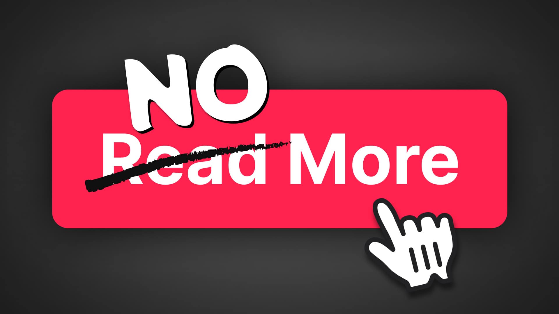
But First, Why a “Read More” Link is a Problem
Imagine landing on a blog page, trying to browse through posts looking for something to read — with your eyes closed. You press the tab key on your keyboard, expecting to hear a list of post titles read aloud. Instead:
“Link. Read More.”
“Link. Read More.”
“Link. Read More.”
As a sighted user, it’s easy to take visual cues for granted — but remove them, and a site like the example above becomes entirely useless.
Even if you were to link both the post title and the “Read More” button, users still have to tab through and hear “Read More” announced between each article for no good reason.
And if the accessibility side of it isn’t convincing enough, “Read More” doesn’t tell search engines much about your internal linking either.
It’s bad for users, bad for screen readers, and bad for search engines — and it’s totally avoidable.
Two Ways to Avoid Meaningless “Read More” Links
As much of a case as you can build against the “Read More” link, there’s no doubt it’s a pattern we’ve all grown accustomed to. Some designs even feel incomplete without it.
But the good news is, there are ways to fix the accessibility problems without sacrificing the design you (or your client) prefers.
Screen-Reader Only Text
This first solution is simple. Nothing changes visually, but thanks to screen-reader-only text, your button instantly gains meaning.
Here’s what a typical “Read More” link might look like in your HTML:
<a href="https://yoursite.com/my-trip-to-france">Read More</a>A screen reader is only going to announce the anchor text — which gives us the “Link. Read More.” problem.
But by adding a <span>, a class, and some context, we can embed “hidden” text inside the anchor tag that provides real meaning:
<a href="https://yoursite.com/my-trip-to-france">
  Read More <span class="sr-only">about My Trip to France</span>
</a>
In this second example, we’ve added the text “about My Trip to France” inside a <span> with a class of sr-only. With some simple CSS, this text is visually hidden but still read aloud by assistive technology.
Here’s the CSS you’ll need:
.sr-only {
  position: absolute;
  width: 1px;
  height: 1px;
  padding: 0;
  margin: -1px;
  overflow: hidden;
  clip: rect(0 0 0 0);
  white-space: nowrap;
  border: 0;
}
Visually, the button still says “Read More,” but the screen reader will now say:
“Read More about My Trip to France”
Here’s a comparison of the visual design and the screen reader output from a recent video I produced:
That’s a big, big difference.
Link the Title, Skip the Button
We can use the default behavior of screen readers to our advantage. If you link the post title itself, the screen reader will announce it exactly as written.
That doesn’t mean you have to get rid of your “Read More” button if you prefer the look — but you’ll want to make sure it’s ignored by screen readers to prevent redundant announcements.

To do that, add two attributes to your “Read More” link:
<a href="https://yoursite.com/my-trip-to-france" aria-hidden="true" tabindex="-1">Read More</a>By adding aria-hidden="true" and tabindex="-1", you’re telling assistive technology to skip the link and preventing it from being focusable via the keyboard.
That means, instead of hearing both the post title and the “Read More” button for every post, screen reader users will only hear the title — which is far more helpful.
See It in Action
If you’re more of a visual learner (like I am), I put together a video walking through how to set up all these options — plus a third solution that avoids the “Read More” link entirely.

Like anything new, adapting your process to be more inclusive might feel like an extra step at first — but once you get used to it, it only takes a few seconds.
A few seconds well spent, considering these tweaks can take your site from unusable to meaningful for a wider range of visitors.
Kyle Van Deusen
After spending 15 years as a graphic designer and earning a business degree, I launched my agency, OGAL Web Design, in 2017. A year later, after finding the amazing community around WordPress, I co-found The Admin Bar, which has grown to become the #1 community for WordPress professionals. I'm a husband and proud father of three, and a resident of the Commonwealth of Virginia.


