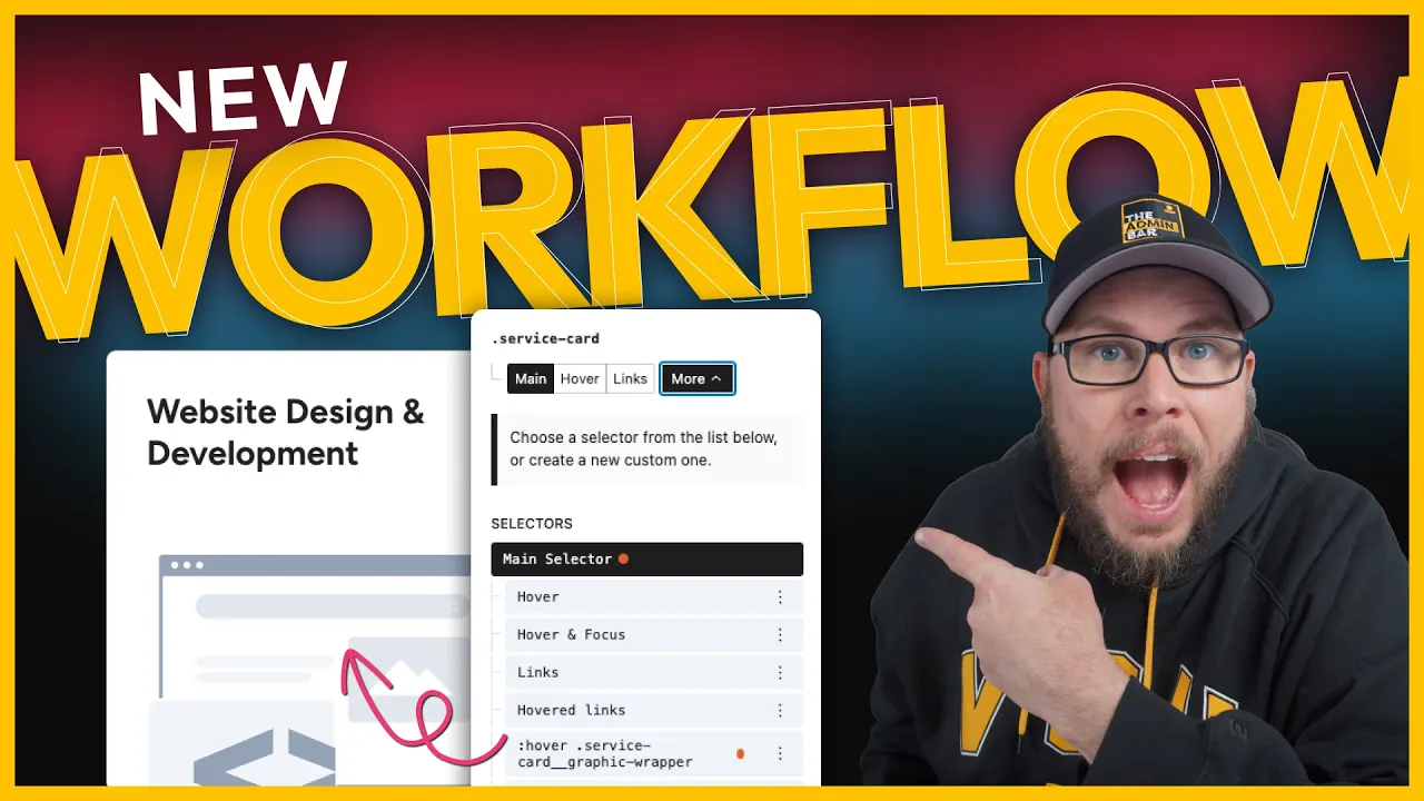
Today’s post is a little different from my usual tutorials. Typically, I plan out my videos, practice the steps, and script everything to ensure a clear and straightforward path from start to finish. However, this time, I wanted to try something unscripted.
With the new version of GenerateBlocks, we now have access to pseudo selectors, compound selectors, pseudo classes, and more advanced tools. I wanted to push the limits of what’s possible inside the builder and share my process of figuring things out, troubleshooting issues, and discovering new features along the way.
While this approach led to some mistakes and even the discovery of a few bugs in the alpha version of GenerateBlocks, I think it’s valuable to show the workflow of working with these new tools. Let’s dive in and explore!

Setting Up the Page
Step 1: Add Containers
I started with a blank page and added a container, followed by an inner container. For some reason, the inner container didn’t come with auto margins on both sides, so I fixed that manually.
To give the section some space, I created a new class called section-default.
- Spacing: 80px top, 24px sides, and 80px bottom.
- Tablet Adjustment: Reduced side spacing to 16px.
I labeled the outer container as “section” for clarity in the list view.
Step 2: Set Up the Grid
Inside the wrapper, I wanted a three-column layout. I created a utility class called grid-three and set the display property to grid.
Using the built-in presets, I selected the repeat(3, 1fr) option to create three equal columns.
Step 3: Add Grid Items
For the grid items, I added containers and labeled them as “service cards.” Each card would contain:
- A headline.
- A description wrapped in a container.
- A graphic wrapped in another container.
I labeled each element for easy reference:
- Service Card
- Description Wrapper
- Graphic Wrapper
Styling the Service Card
Step 1: Add Padding and Borders
For the service-card class:
- Padding: 40px.
- Border: 1px solid light gray.
- Border Radius: 12px.
Step 2: Add a Box Shadow
I added a subtle box shadow:
- X-axis: 0px.
- Y-axis: 5px.
- Blur: 40px.
- Spread: -7px.
Step 3: Set Position
Since I planned to absolutely position some elements inside the card, I set the position of the card to relative.
Adding Hover Effects
Step 1: Hide the Description
I wanted the description to be hidden by default and only appear on hover.
For the description-wrapper class:
- Transform: Translate down by 100%.
- Opacity: 0.
- Transition: 0.25s ease-in-out.
Step 2: Show the Description on Hover
To make the description appear on hover, I created a compound selector:
css
.service-card:hover .description-wrapper
For this selector:
- Transform: Reset to 0.
- Opacity: 1.
This worked perfectly on the front end, but I ran into some issues in the editor where the hover effect wasn’t displaying correctly.
Styling the Graphic
Step 1: Position the Graphic
For the graphic-wrapper class:
- Position: Absolute.
- Offset: -12px to the right and bottom.
To ensure the graphic didn’t overflow the card, I set the overflow property of the service-card class to hidden.
Step 2: Align the Graphic
I wanted the left edge of the graphic to align with the left edge of the text. To achieve this, I used a calc() function:
css
width: calc(100% - 28px);
This calculation accounts for the card’s padding (40px) minus the 12px offset.
Step 3: Add Hover Effects
On hover, I wanted the graphic to fade out and scale up.
For the graphic-wrapper hover selector:
- Opacity: 0.1.
- Transform: Scale to 1.5.
- Transform Origin: Center.
- Transition: 0.25s ease-in-out.
Adjusting the Layout
Step 1: Increase Card Height
To prevent the graphic from overlapping the text, I increased the minimum height of the card to 450px.
Step 2: Center the Text
To center the text vertically, I changed the card’s display property to flex and set the direction to column. Using space-between, I ensured the headline stayed at the top and the description at the bottom.
Adding a Button
Initially, I added a button inside the description wrapper. However, because the description was hidden by default, styling the button in the editor became challenging.
To temporarily fix this, I set the description’s opacity to 1 and reset the transform property. This allowed me to add and style the button.
Making the Entire Card Clickable
Instead of using a button, I decided to make the entire card a link.
Step 1: Add a Link
GenerateBlocks offers two options for making a container clickable:
- Hidden Link: Adds a hidden link inside the container.
- Wrapper Method: Makes the entire container a link but can break if there are links inside.
I chose the hidden link method and added an ARIA label for accessibility:
html
View our website design and development services
This worked well, and I tested it with VoiceOver to ensure it announced the link correctly.
Lessons Learned
At the end of the process, I realized I had styled the hover state but forgot to account for the focus state. This oversight led to additional troubleshooting and the discovery of some bugs in the alpha version of GenerateBlocks.
While these bugs will likely be fixed in future updates, it’s a good reminder to always consider the focus state when styling hover effects.
Final Thoughts
This post was less about presenting a polished tutorial and more about sharing the process of exploring new features in GenerateBlocks.
Working with pseudo selectors, compound selectors, and advanced tools can be challenging, but it’s also an opportunity to learn and troubleshoot. I hope this walkthrough gave you insight into how to approach these tools and how to solve issues as they arise.
If you’re new to these features, I recommend experimenting with them in your own projects. As GenerateBlocks continues to evolve, these tools will become even more powerful and integral to building advanced designs.

Kyle Van Deusen
After spending 15 years as a graphic designer and earning a business degree, I launched my agency, OGAL Web Design, in 2017. A year later, after finding the amazing community around WordPress, I co-found The Admin Bar, which has grown to become the #1 community for WordPress professionals. I'm a husband and proud father of three, and a resident of the Commonwealth of Virginia.
Use of AI: AI helps me outline, research, catch typos, and find better words & phrases. I take full personal responsibility for all my published content (the good, the bad, and the em dashed).