When I asked in The Admin Bar Facebook group what accessibility questions people have, there were questions about mobile nav and hamburger menu accessibility.
I’ve previously written about navigation menu accessibility in general and accessibility for secondary navigation menus. This article is about the additional considerations that need to be made for accessibility in mobile menus.
No Hamburger Menus on Desktop
In recent years, I have seen fewer websites designed with mobile menus on desktop. However, there are many themes out there, especially older themes created a few years ago, that aim for a “minimalist” aesthetic and utilize a mobile (a.k.a. a hamburger) menu on desktop.
There is research going as far back as 2014 that finds that users may have difficulty finding content on websites without a visible navigation bar. Though having a collapsed menu on desktop isn’t a Web Content Accessibility Guidelines (WCAG) violation, it’s a design choice that is less user-friendly than a visible menu.
Compare, for example, this side-by-side of the Visit California website from 2016 and now.

In the 2016 version of the Visit California website (hat tip, Adrian Roselli), the header has a Map link, a search icon, and a hamburger menu. Clicking the hamburger menu opens the site navigation in a menu on the right side of the site.
On the current website, the navigation menu has visible links: Places To Visit, Things To Do, Trip Inspiration, and Road Trips. These links appear to the left of the hamburger icon, which now includes the word “more” along with the icon.
If you were planning a visit to California, which nav menu would you find more helpful? Most likely, you’d say the current, visible menu is better because it surfaces key pages.
Whether you’re designing custom websites or evaluating an existing theme for use as a starter, prioritize making crucial pages visible in the primary navigation and avoid mobile navigation on desktop menus to help people move through the site faster.
Why Mobile Nav Accessibility
Wondering why your mobile navigation menu needs to be keyboard accessible if you’re not supposed to show it on desktop or laptop displays?
Your mobile navigation menu needs to work with a keyboard for two key reasons:
- People with low vision will zoom websites 200-400% to make the text larger. When websites are zoomed this much, they will adapt the mobile styles, and the mobile menu will be visible on desktop to low-vision users. Some of these users may be unable to use a mouse and will be keyboard-only users.
- Blind people who visit websites don’t only use computers. Many users use a screen reader like VoiceOver on their iPhones to engage with the web. Just as websites need to work on desktop for screen reader users, they also need to work with screen readers on mobile devices, which includes having screen reader-friendly mobile navigation.
Key Things to Watch Out For
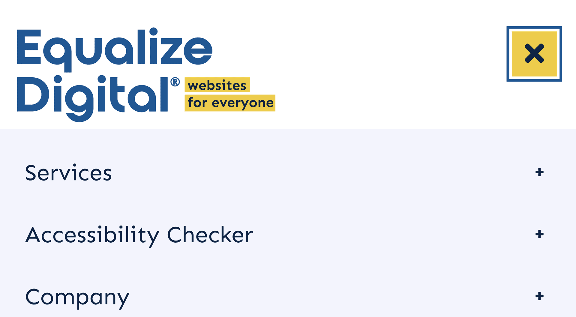
Above is a screenshot of the Equalize Digital website zoomed to 400% and showing the mobile nav opened on the site. There are three items visible below the logo and button to close the menu; each item has a button with a plus icon next to it, indicating there are sub-items.
When assessing this (or any) mobile menu for accessibility, here is what you want to check for:
- You can tab from the logo to the button that opens the menu.
- The button that opens the menu is an actual button and can be triggered with the Enter/Return key or Space Bar.
- The button that opens and closes the menu needs to function like an accordion with aria-expanded and aria-controls attributes.
- The icon on the menu can change (from a hamburger icon to an X as is shown in the example above), but the aria-label or screen reader text on the button should not change. (I.e., it shouldn’t go from “Open Menu” to “Close Menu.”)
- Once you have opened the menu with a keyboard, hitting the Tab key takes you to the first item in the menu, not the somewhere on the page behind the menu.
- If there are submenus/dropdowns and the top item is linked, there is a way to go both to the top item link and also to expand the collapsed sub menu (for example, the + buttons in the screenshot above).
- The header is not sticky, so if the user needs to scroll down to access more menu items, they have full use of the window height.
- All items pass color contrast.
- There’s a visible focus outline as each element receives focus.
- All buttons have a reasonable tap-target size that can be tapped easily by people with limited dexterity. The recommended minimum is 44×44 pixels.
- Treat the mobile menu like a popup and add a focus lock – don’t allow users to tab past it without closing it.
- Allow the mobile nav to close with the escape key.
- When closing the mobile menu, the user should still be in the header with their focus returned to the button that triggered it, not anywhere else on the page.
What’s with all the aria-hidden?
If you use our WordPress Accessibility Checker plugin, you may notice that it flags ARIA hidden warnings on the hamburger icon, down carets, and close icons in many themes’s nav menus.
As described in the Accessibility Weekly ARIA Hidden article, aria-hidden=”true” is an HTML attribute that can be added to any element to tell screen readers to skip it and anything contained within it.
In many instances, it is correct to hide hamburger and other nav menu icons from screen readers because there is an alternate way of naming the buttons and the image is unnecessary noise to a screen reader user. However, if the theme developer has not provided screen reader text or an aria-label on the button, then a possible fix would be not to hide the icon and give it the correct alt text instead.
If you encounter alerts or warnings about aria-hidden attributes in an accessibility testing tool, all you need to do is inspect the element on the front end and determine if there’s an accessible name for the button. Here are two good examples from popular themes.
Kadence uses the aria-label attribute on the button tag:

GeneratePress uses hidden screen reader text within the button tag:

If you see one of these two things, you can safely ignore any ARIA hidden warnings for icons in the buttons. If neither are there, then the button may need to be fixed.
Testing Mobile Nav Accessibility
The best way to tell if your mobile nav menus are accessible is to test them. You can use an automated tool like Accessibility Checker, and you should also manually check for problems.
Haven’t tested a mobile nav menu for accessibility? It’s easy! Open the website in any browser, zoom in until you see the mobile nav on your computer, and use your keyboard and a screen reader to check for problems, keeping in mind the “what to watch for” list above.
Have questions? Comment on this post in the Facebook group.
Join the Conversation!
There's a dedicated thread on this post inside of The Admin Bar community. Join in on the conversation, ask questions, and learn more!
Group Thread

