Color contrast failures are the most common accessibility problem found on websites during automated tests. Ensuring the websites you design have good color contrast means the text on those sites will be easy for website visitors to read – whether they are a person with low vision or a typically-sighted person surfing the web outside on their cell phone on a sunny day.
If a website is challenging to read, users may abandon it entirely or miss important information, leading to lower conversion rates. Want to avoid that? Read on for more information on how to ensure the websites you build have good color contrast.
Color Contrast Accessibility Requirements
Web Content Accessibility Guidelines (WCAG) provides contrast ratios that are calculated using luminance values to measure if text or interface components are sufficiently visible. Luminance refers to the perceived brightness of colors (“perceived” because some colors appear brighter than others even if they have the same level of lightness).
When we talk about this contrast ratio, we’re looking at how much brighter or darker the text color and inputs or functional icons are compared to the background color.
WCAG AA Color Contrast Requirements
WCAG 1.4.3 Contrast (Minimum) requires:
- Normal-sized text needs a contrast ratio between the text and its background of at least 4.5:1.
- Large text (at least 24px) needs a contrast ratio of at least 3:1.
These are the minimum acceptable color contrast ratios for a website to be considered accessible.
WCAG AAA Color Contrast Requirements
WCAG AAA requirements provide a higher level of accessibility. To meet the WCAG AAA requirements for color contrast, the following criteria need to be met:
- Normal-sized text needs a contrast ratio of at least 7:1.
- Large text needs a contrast ratio of at least 4.5:1.
Non-text Contrast
Color contrast requirements extend beyond text. WCAG also requires a contrast ratio of 3:1 for user interface components (form fields, buttons, etc.) and graphics required to understand the content.
Exceptions
There are a few exceptions where elements are not required to pass color contrast minimums, and the website would still be considered accessible:
- Logos.
- Decorative or non-functional graphics or icons.
- Disabled or inactive buttons or links.
- An image of text in a photograph containing significant amounts of other visual content (like a photo that includes a sign on a wall).
How to Calculate Color Contrast
There’s a complex mathematical formula for calculating color contrast, but honestly, I’ve never bothered to learn it because there are handy tools out there that do all the work for me. The tools I use most frequently are WebAIM’s color contrast checker and Eightshapes’ Contrast Grid, but I’ll also check color contrast in Chrome dev tools or with our Accessibility Checker plugin.
Check for Contrast During Design
Color contrast issues are an example of an accessibility problem that frequently gets added before the website is built or a single line of code is written. Designers, not developers create color contrast issues.
If you’re designing a website for a client, it’s essential to check the accessibility of their brand color palette before any other design decisions are made. Early in our website discovery phase, I’ll put all of the client’s brand colors into Eightshapes Contrast Grid to create an image that tells us what colors can be used together.
Here’s an example color contrast grid from one of my clients:
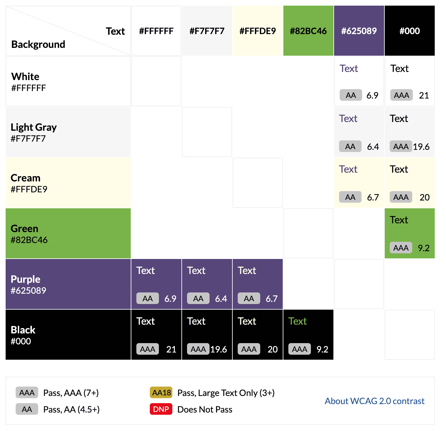
When I create the grid in the Eightshapes tool, I’ll turn off the setting for showing combinations that don’t pass and combinations that only pass for large text. We want to design with combinations that pass for any size text because it’s easier to keep accessible on mobile without having to keep the text larger than 24 pixels.
Then I’ll take this grid and use it to discuss with the client their color palette, then determine if we need to modify existing colors or add additional colors.
What if Brand Colors Don’t Meet AA?
Someone recently asked in a post in The Admin Bar Facebook Group, “What do you do when brand colours are not a minimum of WCAG AA?”
A common misconception about color contrast is that there are “inaccessible colors” or that meeting color contrast requirements will require the website only to have very bold colors. This is simply not the case. There are no such thing as inaccessible colors, just inaccessible combinations.
Examples of Accessible Websites With “Light” Colors
Having an accessible website doesn’t mean you can’t use light or pastel colors, you just have to think carefully about how they are used.
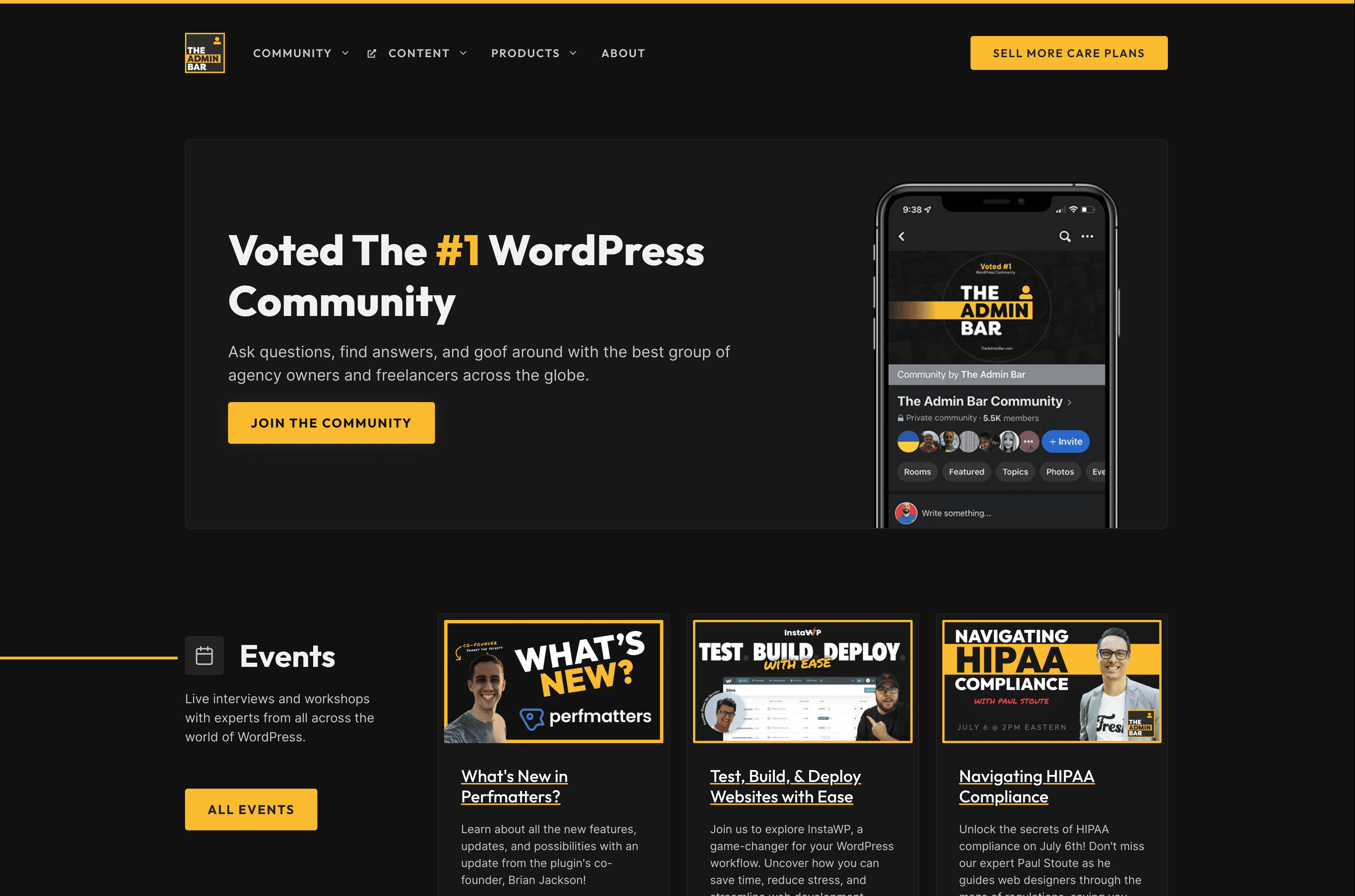
The Admin Bar website is an excellent example of this. Kyle uses yellow as an accent color, but it’s easy to read because he combines it with black and dark gray text rather than white.
The WordPress Accessibility Day website is an example of a website with a pastel color palette.
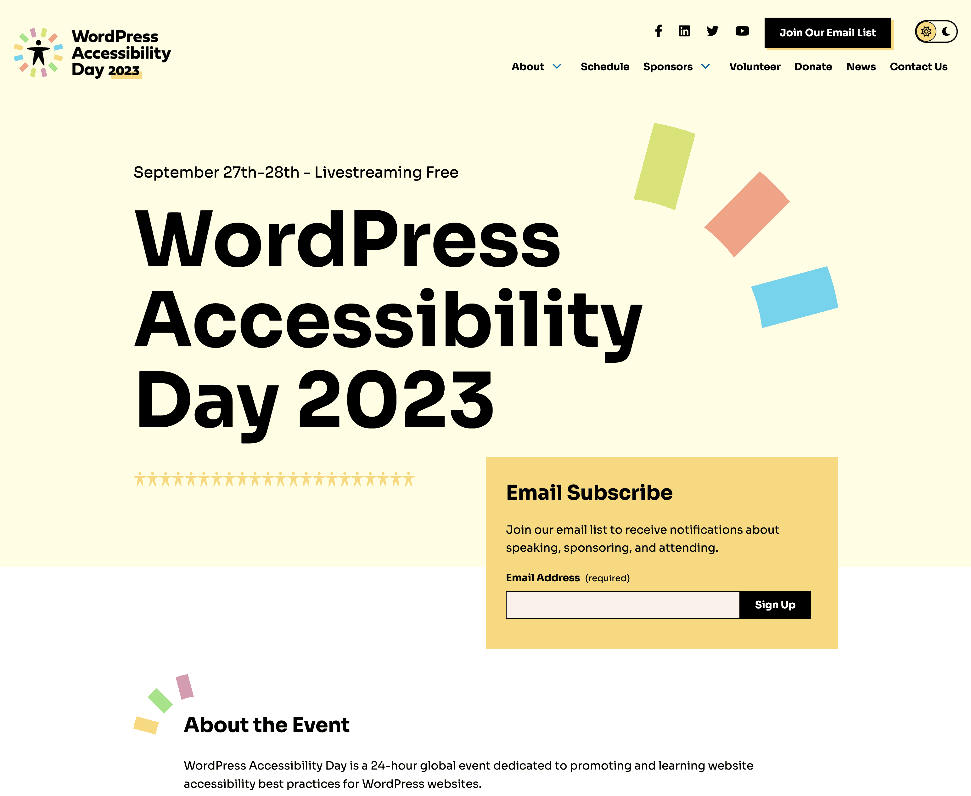
This is a palette that seeming “fails WCAG,” but because the colors are always used with black text, it maintains AAA color contrast and still manages to feel very light and airy.
The website also has a dark mode version which showcases how the same color palette can be used to create an accessible website with a darker feel.

Talking to Clients
If you have a client with a very light color palette, I would first ask them how they feel about having a darker aesthetic. Do they like dark designs? If that’s the case, you may be able to use their color palette as it is.
Another thing to consider is how they want colors used together and if they are open to modifying colors in their brand palette.
In the contrast grid example shared above, green and purple were the client’s logo colors, and they didn’t want them to be modified. The purple works with white text but not black, and the green works with black text but not white. The green and purple could not be used on one another.
The client wanted lighter backgrounds, but we didn’t want only to have purple or black text. So we ended up introducing a darker green we named “WCAG Green” that passed for AA on white backgrounds.
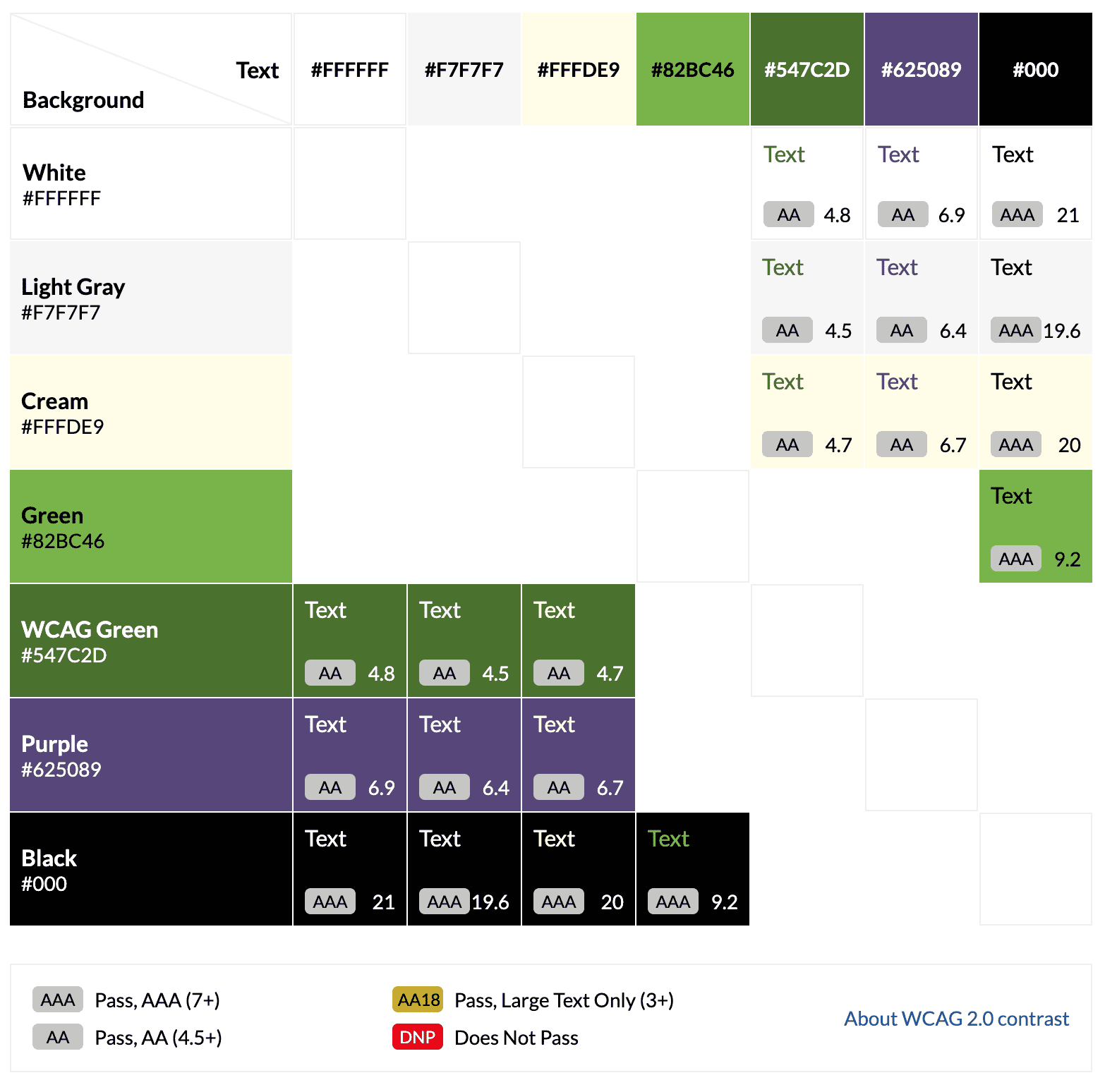
This gave us more flexibility in the design for how and where we could use green while maintaining the client’s brand aesthetic. And, though the colors appear pretty different from one another in the grid, in practice, it’s subtle enough of a difference that it’s hard to tell the two apart.

Sometimes clients may be opposed to adding shades or colors to a design initially, but if you explain the importance of contrast for readability and show them examples of what designs look like with additional colors, they can typically be convinced.
Additional Resources
Want to read more about color contrast? Check out these resources:
Join the Conversation!
There's a dedicated thread on this post inside of The Admin Bar community. Join in on the conversation, ask questions, and learn more!
Group Thread

