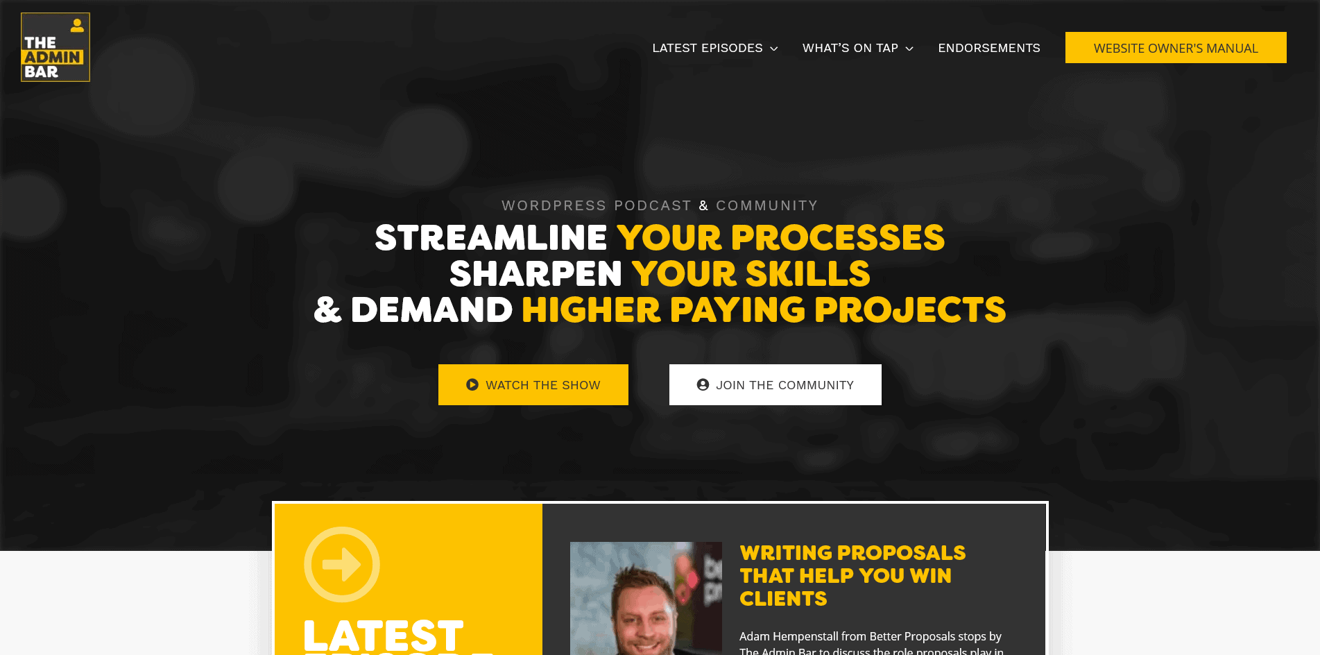
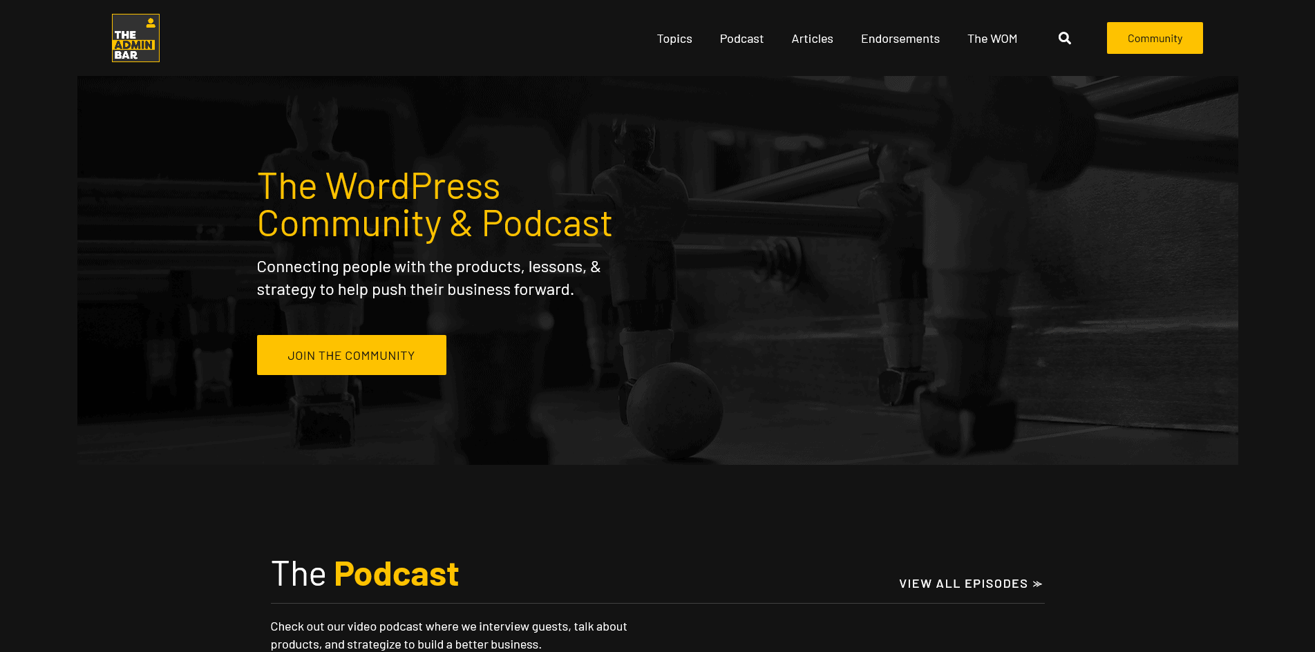
If you’re reading this and you’ve been to our website before, you might be noticing things look a little different around here.
The truth is, the original website was thrown together pretty quickly… and at the time we had very little idea of what The Admin Bar would become.
We’ve patched and patched, and as we approach 2,000 members in our community, we figured it was time to give it a fresh coat of paint.
What we’ve realized is that this site should be the “hub” for all the content that’s produced around our show, guests, products, discussions, etc. So our approach with the redesign is to make getting to that content a whole lot easier (read more on this in the “Navigation” bullet point below).
A Few Things to Notice
For the most part, the content on the site is the same… but there are a few new things to check out.
Navigation

The biggest need for the site overhaul was the navigation. This site has ended up being all about CONTENT… but it wasn’t easy to find what you’re looking for. Of course, you can still get to the podcast show pages, but there’s a new “Topics” menu which will allow you to filter the content by topic (which is much better UX!). These filters will pull in content of any kind (blog, podcast, one-off, or endorsement). Our hope is this will make all our content more useful for you.
Dark Theme
The most drastic change is the UI of the website. A completely new “dark mode” look, using GeneratePress as the site’s theme (swapped out from Astra).
Pub Games

For a little fun, we’ve included some of the best pub games in the page hero sections. It’s subtle and not over the top— but brings in a little of the “fun” that you know we like to have at The Admin Bar.
Typography

We’ve ditched the use of Filson Soft from the website, but it remains in the logo (for now at least 😉 ). The font was alright, but the lower case letters didn’t look good, and it was funky at thinner weights… This meant every time we needed to use it, it had to be 900 weight and all caps. Just not very versatile. The new typeface, Barlow, is clean and easy to read…. and looks great just about any way you use it.
Endorsements (in progress!)
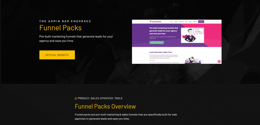
Instead of the old endorsements page (which was basically an image and an affiliate link), we’re doing a complete overhaul to give you more information on why we endorse any particular product. There are a few in there already, and we’ll be adding to this list in the near future. Inside each ‘Endorsement Post’, you’ll find an overview of the product, a section on “why we love it” and any additional or bonus content we’ve done that relates. Sure, we do affiliate marketing… but we don’t want to just throw links in your face. By providing you with lots of content, we hope you’ll have a better understanding of why we’ve choose to partner with any given product, course, etc.
We hope you enjoy!
The site isn’t what I would call “done” at this point, but it was “done enough” to get it out there and start being useful. Over time we’ll be adding plenty of more content, as well as going back and making sure we have all the old content categorized properly (this is still a work in progress).
I’m sure you don’t spend a ton of time on our website, but now when you do I hope it’s more enjoyable.
Cheers!

