Between 9% and 12% of all people worldwide have dyslexia. Let that sink in. That’s 720 million people. With so many dyslexics around the world, it’s incredibly important to take their needs into account for the accessibility of your website. In the US particularly, websites owners are being sued if they’re not accessible to people with disabilities.
Of course, you want your website to be accessible to everyone. If you don’t have dyslexia yourself, it’s quite a challenge to understand how it impacts online browsing. Fortunately, German web designer Maja Benke gave an interesting presentation at WordCamp Europe 2022, which gave me the inspiration to write this blog and to get you started on the road to a dyslexia-friendly website.
Dyslexia: what exactly is it?
You might already have an idea of what dyslexia is, or at least what it involves: letters seem to dance, reading is difficult, and writing is exhausting. In short, people with dyslexia have difficulty converting spoken word to written word and vice versa.
Dyslexia is actually a learning disability. And not just any learning disability; it is the most common learning disability in the world. As many as 80% of all people with learning disabilities have dyslexia. Of course, that doesn’t mean that all these people are the same.
What these people do have in common is that the processing of text in the brain is different from people who do not have dyslexia. A few facts about dyslexia:
- Dyslexics have difficulty converting speech into writing
- Dyslexics have difficulty converting writing into speech
- The way the dyslexic brain works is different from other people
- Dyslexia is a spectrum
People with dyslexia are not stupid or lazy, which is a common misconception.
If you have dyslexia, you can read and write normally. Dyslexics have been proven to be no less intelligent than the rest of the population – at least not because of his or her dyslexia. Dyslexics are often very creative and they’re good at thinking logically and conceptually.
The extent to which someone suffers from his or her dyslexia varies from person to person. Reading is especially difficult when dyslexics are tired or stressed, cannot focus, or are in a distracting environment.
When it comes down to it: it would be a shame if you alienated 12% of your website’s visitors by overlooking their basic needs.
How do dyslexics see your website’s text?
Writing and displaying text that is easy to read for dyslexics is a challenge. If you use the wrong fonts or line spacing, letters will start to dance. Double negatives in phrases can go unnoticed and dyslexics can skip over some words. That can become a big issue if those missed words are words like ‘not’ and ‘none’.
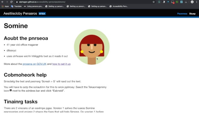
If you don’t have dyslexia yourself, I’d like to give you an idea of what its like to read a text when you are dyslexic, see the picture below:
Improving accessibility with physical and digital tools
Not everyone experiences dyslexia in the same way, but there are a few different solutions to help. You may remember seeing them in primary and secondary school: colored paper for reduced contrast, a ruler for following the rule, or a handy reading strip.

Now there are also digital tools to help, and its important to check whether these digital tools work well on your website. For example, make sure that you do not process text in images, but keep it eligible for the computer.
Examples of commonly used digital ‘reading tools’ for dyslexics are:
- Software that converts text to speech
- The Firefox Reader Mode, which strips everything out, but leaves the text
- Browser extensions that adjust fonts, sizes, widths and colors
But the best thing is (of course) when your site already works well without these tools. Here’s how to do it.
Choose a dyslexia-friendly font
An infinite amount of research has been done into what is or is not pleasant reading for dyslexics. There are even special fonts just for dyslexics! Just search for Open Dyslexic and Atkinson Hyperlegible. Pretty nice, but I can imagine that you’d prefer to stay closer to your own brand identity.
In any case, make sure that your font and text style meet the following requirements:
- A font size of at least 16px
- A line height of at least 1.5m
- Make characters look distinctly different. Think of the capital letter i (‘I’), the letter l, and the number 1
- The same goes for the number zero (‘0’) and the letter ‘O’ and for the letters ‘q’ and the ‘g’
Avoid bold and italic text, or all capital letters
Dyslexics often learn the ‘form’ of common words by heart, that way they don’t have to read these words letter by letter. When you change the appearance of a word, for example by displaying it in bold or italics, the shape of the word changes. A dyslexic does not recognize the form and has to read the word after all.
A site like Wikipedia makes extensive use of bold and italicized text, and is therefore an excellent example of a website that is not pleasant or easy for people with dyslexia to use.
Accessible layout for dyslexia
Your site’s page layouts are also of great importance for the readability of your website. This also applies to visitors without dyslexia: an accessible layout is a plus for everyone!
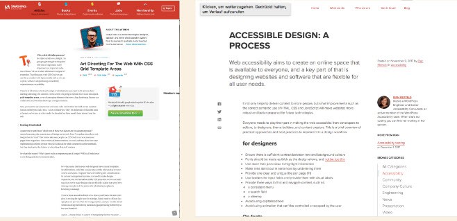
First of all, don’t make the text area too wide. Between 400px and 700px is optimal. Also make sure you have plenty of white space. It’s best to write in smaller paragraphs instead of large blocks of text. Preferably do this in a clear and logical layout. For example, provide clear headers, use bullet points and center texts as little as possible.
In the example below, the left-hand website is difficult to read. In contrast to the website on the right, with a lot of white space and a pleasant layout.
Choose the right colors for accessibility
Many dyslexics have difficulty with high-contrast texts. It is therefore better not to opt for black on white, but instead, for example, for dark gray or dark blue on off-white.
But of course you can achieve even more with colors.
Sharp contrasts or ‘pure’ colors do not promote easy reading, especially for dyslexics. For example, do not place red on green. Making a Dark Mode available is a great option.
Write dyslexia-friendly text
A good layout, pleasant font and fine colors will go a long way. But do you really want to make your website easily accessible for dyslexics? Then immerse yourself in writing good text.
Dyslexia-friendly text has:
- The most important information at the beginning of the text
- A clear summary as a conclusion
- Clear headers, bullets, and quotes for variety
- Short paragraphs
- One piece of information per sentence
- Active language use (i.e. “I was” instead of “I have been”)
- Explanatory images, tables, or graphs
You won’t find this in a dyslexia-friendly text:
- Sarcasm (unless clarified with emojis, for example)
- Animated GIFs, flashing elements, and popups
- Abbreviations not written out (unless the abbreviation is commonly used, like VAT)
- Foreign words and filler words
- Links and buttons with generic text like ‘click here’ (instead, describe exactly what happens when someone clicks on that button or link)
- Incomplete information because you think the reader already has certain knowledge
Need an extra pair of eyes to make your site dyslexia-friendly? Sometimes it takes some puzzling before you realize what works well for your site. Feel free to contact me. If possible, I’ll gladly take a moment to help you out.
—
Translated from Dutch by Anita Van Den Bos


