One of the biggest challenges we face as designers is figuring out how to lay out content in a way that’s both functional and visually interesting. Sure, we’ve all leaned on the tried-and-true column layouts or the classic “image on the left, text on the right” approach. And let’s be honest, flipping that layout back and forth down the page can get repetitive—and boring—fast. Guilty as charged.
That’s why solutions like the one I’m about to show you are so exciting. It achieves the same goal of presenting multiple sections of content but does so in a more interactive and unique way. This design combines the functionality of a tabs block with the aesthetic of an accordion block, creating what I like to call the Tab-Cordion. It’s a hybrid that lets users toggle between sections while keeping the layout clean and engaging.

This isn’t a pre-built block you can grab straight out of GenerateBlocks—it’s something I Frankensteined together. But don’t worry, it’s surprisingly simple to set up once you know the steps. In this tutorial, I’ll walk you through how to build one from scratch, starting with a tabs block and tweaking it to create the accordion effect.
What Is a Tab-Cordion?
Before we dive in, let’s clarify what we’re building. A Tab-Cordion combines the functionality of tabs (where users click to switch between sections) with the visual style of an accordion (where content expands and collapses). It’s perfect for situations where you want to present multiple sections of content without overwhelming the user.

This design won’t work for every layout, but in the right context, it can be a great way to add interactivity and visual interest to your site.
Video Tutorial
The written instructions will take up the bulk of this post, but if you prefer to learn by watching, here’s a full video tutorial:

Step 1: Setting Up the Tabs Block
To get started, we’ll build a basic tabs block. Here’s how:
- Add the Tabs Block:
- Start with a default section that includes a wrapper.
- Add the Tabs Block from GenerateBlocks.
- Choose the Tabs Style:
- You’ll see three options: Horizontal, Vertical, and Button Tabs.
- I recommend starting with Button Tabs because they behave predictably and have less inherited styling. Don’t worry—we’ll switch to a vertical layout later.
- Understand the Structure:
- The tabs block includes:
- Tabs Menu: A wrapper for the tab buttons.
- Tab Menu Items: Individual buttons for each tab.
- Tabs Items: A wrapper for the tab content.
- Tab Item: The content inside each tab.
- The tabs block includes:
Now that we have the basic structure, let’s start customizing.
Step 2: Adding Classes for Styling
To make styling easier, we’ll add custom classes to each part of the tabs block. This ensures we can target elements consistently across the design.
- Add Classes:
- Prefix all classes with
tc-(short for Tab-Cordion) for clarity. - Example classes:
tc-tabsfor the main tabs block.tc-tabs-menufor the tabs menu.tc-tab-menu-itemfor individual tab buttons.tc-tabs-itemsfor the tabs content wrapper.tc-tab-itemfor individual tab content.
- Prefix all classes with
- Move Local Styles to Classes:
- If any styles are applied directly to the block, move them to the corresponding class. This keeps everything organized and reusable.
Step 3: Creating the Layout
Now that the classes are set up, let’s adjust the layout to achieve the desired look.
- Switch to a Vertical Layout:
- Go to the
tc-tabsclass. - Under Layout, change the Flex Direction to
row. This places the tab buttons on one side and the content on the other.
- Go to the
- Adjust the Alignment:
- Select the
tc-tabs-menuclass. - Under Layout, set the Order to
2. This moves the tab buttons to the right side of the layout.
- Select the
- Set Column Widths:
- For both the
tc-tabs-menuandtc-tabs-itemsclasses:- Set Width to
100%. - Set Max Width to
50%. This creates a 50/50 split between the tab buttons and content.
- Set Width to
- For both the
Step 4: Adding Content
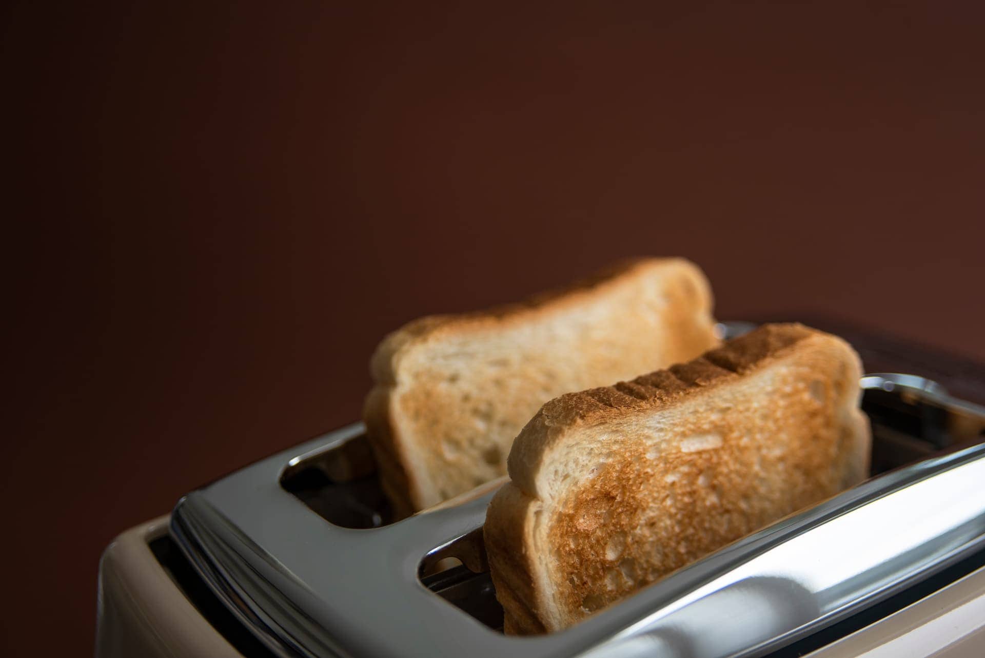
Let’s populate the tabs with content. For this example, we’ll create tabs for the four seasons: Spring, Summer, Autumn, and Winter.
- Add Content:
- For each tab, include:
- A heading (e.g., “Spring”).
- A paragraph of text.
- An image.
- For each tab, include:
- Style the Images:
- Add a class to the images (e.g.,
tc-image). - Apply styles:
- Border Radius:
12pxfor rounded corners. - Aspect Ratio:
3:4to ensure consistent proportions.
- Border Radius:
- Add a class to the images (e.g.,
Step 5: Stacking the Tab Buttons Vertically
By default, the tab buttons are aligned horizontally. To stack them vertically:
- Select the
tc-tabs-menuClass:- Under Layout, change the Flex Direction to
column.
- Under Layout, change the Flex Direction to
- Adjust the Gap:
- Increase the gap between the tab buttons and content. For example:
- Set Gap to
80pxfor desktop. - Reduce it to
24pxfor tablet.
- Set Gap to
- Increase the gap between the tab buttons and content. For example:
Step 6: Adding the Accordion Effect
Here’s where the magic happens. To create the accordion effect, we’ll hide the text for non-selected tabs and expand it for the active tab.
- Wrap Text in a Container:
- Add a container around the text for each tab.
- Assign a class (e.g.,
tc-description).
- Hide Non-Selected Text:
- For the
tc-descriptionclass:- Set Grid Template Rows to
0fr. - Set Overflow to
hidden.
- Set Grid Template Rows to
- For the
- Show Selected Text:
- Use a selector to target the
tc-descriptionof the active tab:- Set Grid Template Rows to
1fr.
- Set Grid Template Rows to
- Use a selector to target the
Step 7: Adding Transitions
To make the accordion effect smoother, add transitions:
- Fade the Images:
- For the
tc-tab-itemclass, set the transition tofade.
- For the
- Animate the Text Expansion:
- For the
tc-descriptionclass, add a transition for the grid template rows. Match the duration to the image fade (e.g.,0.25s).
- For the
Step 8: Responsive Adjustments
Finally, let’s tweak the layout for smaller screens.
- Tablet:
- Reduce the gap between the tab buttons and content.
- Keep the 50/50 split.
- Mobile:
- Stack the tab buttons and content vertically.
- Adjust the image proportions to
16:9for a more horizontal layout. - Set the content width to
100%.
Final Thoughts
The Tab-Cordion is a versatile design that combines functionality and aesthetics. While it’s not ideal for every layout, it’s a great way to present content in an interactive and engaging way. Plus, once you’ve built it, you can save it as a reusable block for future projects.
This tutorial covered a lot of ground, from setting up the tabs block to creating the accordion effect and making responsive adjustments. If you follow these steps, you’ll have a polished, dynamic layout that stands out.
What do you think? Ready to give the Tab-Cordion a try? Let me know how it works for you!
Kyle Van Deusen
After spending 15 years as a graphic designer and earning a business degree, I launched my agency, OGAL Web Design, in 2017. A year later, after finding the amazing community around WordPress, I co-found The Admin Bar, which has grown to become the #1 community for WordPress professionals. I'm a husband and proud father of three, and a resident of the Commonwealth of Virginia.