We often discuss that accessibility begins during the design phase of a website project before even a single line of code is written. We’ve previously discussed color selection and the importance of having good color contrast. Another crucial aspect of accessible web design is choosing the right fonts.
The fonts you include in your clients’ websites significantly affect how easy it is for people to read those websites. This Accessibility Weekly post is all about choosing fonts for accessibility and readability.
What makes a font accessible?
Accessible fonts can be easily read by people with disabilities, including low vision, dyslexia, and other cognitive impairments. Accessible fonts are also easier to read by people who don’t identify as disabled, so choosing the right font can be a true win-win from a design and accessibility standpoint.
Here are some typeface (font) characteristics that make them easier to read.
No Imposter Letters
“Imposter” letters occur when the font has characters that are indistinguishable from one another. Examples of this include:
- Capital I, lowercase l, and the number 1.
- Capital O and the number 0.
When choosing a font to use on the websites you’re designing, check these letter combinations and ensure you can quickly distinguish between them. Here’s an example:

The image above shows these commonly confused characters typed in two different fonts, Museo Sans and Gill Sans. For both fonts, there is a clear difference between the capital O and the number 0 (the O is more round than the 0). However, Museo Sans does a much better job distinguishing between I, l, and 1. In contrast, these characters are all just a straight line in Gill Sans. The only difference is that the 1 has more spacing before it.
Avoid Mirroring
Mirroring in typography refers to designing characters to appear as a mirror image of a similar letter. Letters that frequently mirror one another are lowercase d and b and lowercase p and q.

In the image above, Museo Sans doesn’t fare as well as it did when we were looking for a font without imposter letters. Museo Sans’ lowercase d is exactly the same as the lowercase b, only flipped horizontally. The same goes for q and p.
In contrast, the BBC Reith font has different styling for the d and b and p and q, so they are not exact mirrors of one another. This is a subtle difference but can make it easier for people with dyslexia to interpret the letters and read the website.
Don’t Select Uniform Height
The designer in us likes it when everything lines up neatly across rows. But it can make words more challenging to read if characters all have the same vertical height.
When selecting a font, you want the vertical ascenders (letters like l or the line on a b, h, or d) to be slightly taller than the height of the capital letters.

The image above shows the word “Illustrate” in two different fonts, Oswald and Canva Sans.
Canva Sans showcases how ascenders should be taller than capital letters for better readability, whereas Oswald lines everything up. This, combined with the use of imposter letters, makes it challenging to distinguish between the capital I and lowercase l and will slow down users as they read the site.
Ensure Adequate Spacing
WCAG 1.4.12 Text Spacing (AA) requires that the website still be readable if a user sets the following in their browser or assistive technology:
- Line height (line spacing) to at least 1.5 times the font size;
- Spacing following paragraphs to at least 2 times the font size;
- Letter spacing (tracking) to at least 0.12 times the font size;
- Word spacing to at least 0.16 times the font size.
This success criterion doesn’t require the website to use this spacing, only that no functionality is lost if a user does so. However, this spacing might be worth incorporating into your designs to enhance readability.
If you’re not setting letter spacing in the theme, you’ll want to choose a font that makes it easy to distinguish between letters. Ensure adequate spacing exists between the letters so that someone with a visual disability doesn’t see “ol” as a lowercase d or “vv” as a w, for example.
You can also see in the previous example of the word “illustrate” written in Canva Sans and Oswald (above) that the tight spacing on the Oswald font contributes to it being less readable than Canva Sans which has larger spacing between letters.
Choose Sans Serif
Serif fonts are not definitively better than sans-serif fonts. There’s mixed research on whether serif fonts are problematic for everyone; however, some readability studies find people read sans serif typefaces faster, especially on a screen.
Serif fonts can add to letter confusion, especially in smaller font sizes. Here’s an example that compares Times New Roman (a serif font) to Roboto (a sans serif font) with several words that include the “rn” letter combination.
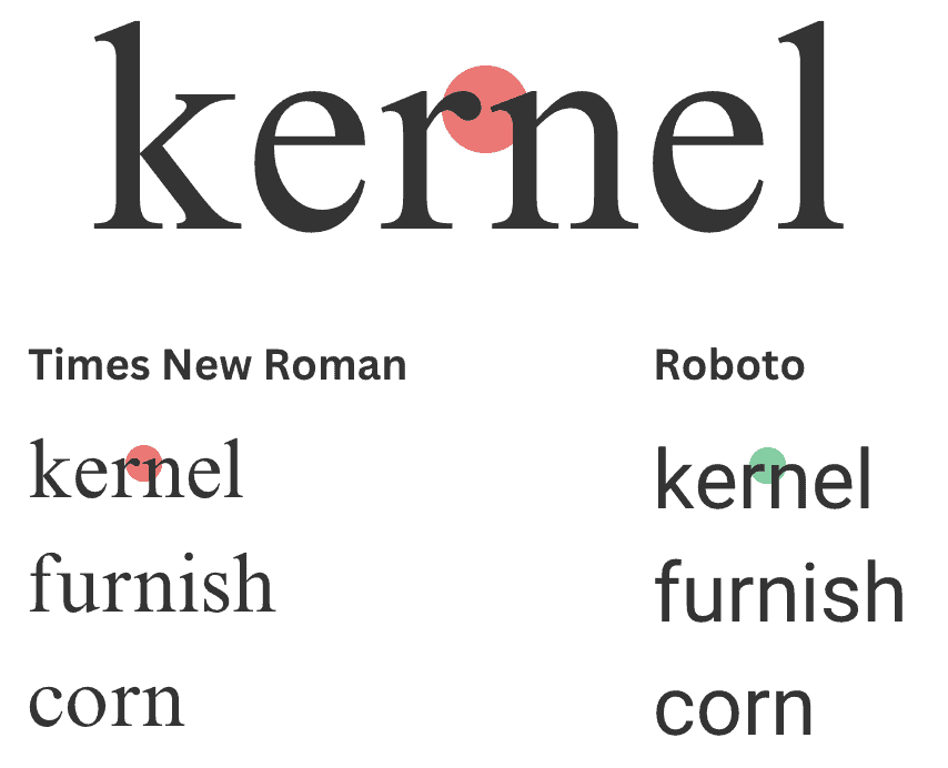
At smaller sizes or with default letter spacing, the “rn” combination in Times New Roman is much more easily confused for a lowercase letter m than is the same combination in the Roboto font.
This doesn’t mean that you can’t use serif fonts in your designs, but if you do, you may want to pay attention to the font sizing and increase the letter spacing to make letters more clearly separated from one another.
Choosing a humanist rather than grotesque typeface is also helpful here because humanist fonts have more varied character widths, which also helps with letter recognition.
Cursive and Handwritten Fonts
When we do design audits at Equalize Digital, we occasionally get asked if it’s OK to use a cursive, handwritten, or other custom display font.
While it doesn’t violate WCAG to utilize these fonts, they can be extremely difficult for users to read, especially people with low vision or learning disabilities. I would try to talk clients out of using fonts like this as much as possible.
If they want to use them, restrict their use to an accent word here and there or a large-size heading. Avoid using cursive or handwritten fonts in large blocks of text such as blockquotes or testimonials.
You Don’t Need a “Dyslexia Font”
There are fonts, such as OpenDyslexic and Dyslexie, that claim to be more legible for people with dyslexia. These fonts strive to make each letter unique to help people with dyslexia recognize letters more easily.
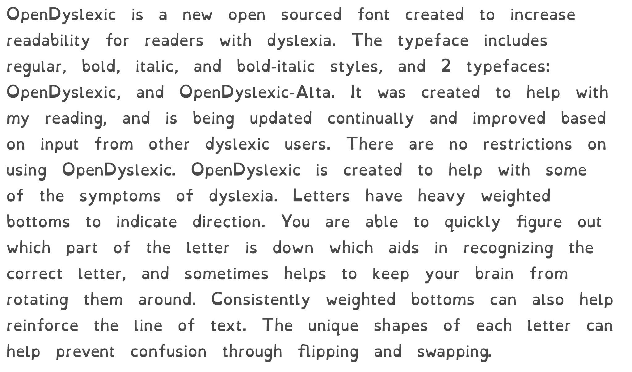
These fonts were created with good intentions. But, to most of us, they are not visually appealing, and you may be worried that using a font like this is necessary.
There is no research to support the use of these fonts.
Many studies have found no benefit to using them, such as this one from 2018: Dyslexie font does not benefit reading in children with or without dyslexia. So, if these “dyslexic fonts” don’t appeal to your or your clients’ design aesthetic, there’s no reason to use them.
There’s No Perfect Font
You may be wondering if there’s a perfect font for readability.
In 2022, the Nielson Norman Group and Adobe conducted a study to identify if there is one best font for online reading. While they did find that font selection can significantly impact readability, not all users read fastest in the same font. There are differences in reading speed and comprehension based on font styling, the user’s familiarity with a given font (if they have seen it before), and the user’s age.
With no perfect font, there’s room for creativity in font selection. Though you may also want to consider website performance and privacy laws in addition to accessibility when selecting fonts.
Additional Resources
Want to dive deeper into typography and readability? Check out these two recorded presentations:
Join the Conversation!
There's a dedicated thread on this post inside of The Admin Bar community. Join in on the conversation, ask questions, and learn more!
Group Thread

