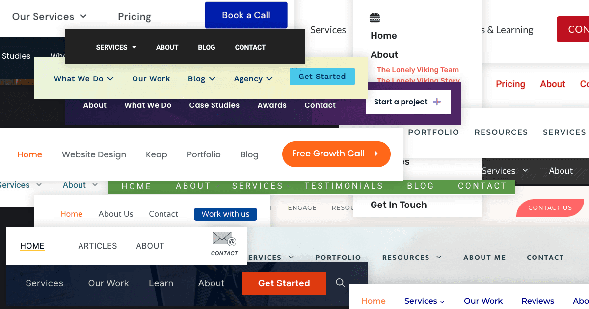
The navigation on my website is something I haven’t given a ton of thought.
Not to say it’s not been considered and tweaked, but after the initial setup, not much has changed.
But it’s arguably one of the most essential parts of your website. Whether or not someone finds what they need when they visit your website largely rests on how well your navigation performs.
And it got me thinking… What do most agencies use in their navigation?
Well… There was only one way to find out; Make an Airtable base and go through over 100 agency websites tracking every item in their top-level navigation.
And that’s precisely what I did (using The Admin Bar Job Board listings as my dataset).
Results By Popularity
Here’s a look at the most popular navigation items (in order). I tried to keep them exactly as presented, but I did combine things like “About”, “About Us” and “About Me” since they are nearly the same.
However, if someone used “Our Work” and “Our Projects” I left a distinction since those could have a slightly different meanings.
I’ll include a few of my thoughts after the chart.
| Navigation Item | Count |
|---|---|
| Contact (Contact Us / Contact Me) | 76 |
| About (About Me / About Us) | 67 |
| Services (Our Services) | 60 |
| Home | 51 |
| Blog | 42 |
| Portfolio | 26 |
| Our Work (My Work / Work) | 22 |
| Get Started | 12 |
| Resources | 10 |
| Case Studies | 7 |
| Pricing | 7 |
| Work with Us (Work with Me) | 7 |
| Articles | 6 |
| FAQ (FAQs) | 5 |
| Website Design (Web Design) | 5 |
| Get in Touch | 4 |
| Learn | 4 |
| Reviews | 4 |
| Shop | 4 |
| Book a Call | 3 |
| Clients | 3 |
| Insights | 3 |
| Let’s Chat | 3 |
| Projects (Our Projects / My Projects) | 3 |
| Solutions | 3 |
| Websites | 3 |
| Who We Are | 3 |
| Book a Consult (Book a Consultation) | 2 |
| Branding | 2 |
| Design | 2 |
| Free Consultation | 2 |
| Free SEO Audit | 2 |
| Other Services | 2 |
| Recent Work | 2 |
| SEO | 2 |
| What We Do | 4 |
| Academy | 1 |
| Accessibility Training Courses | 1 |
| Agency | 1 |
| Awards | 1 |
| Book Your Discovery Call | 1 |
| Build | 1 |
| Care | 1 |
| Care Plans | 1 |
| Careers | 1 |
| Client Portal | 1 |
| Collaborate | 1 |
| Company | 1 |
| Connect | 1 |
| Design & Development | 1 |
| Develop | 1 |
| Digital Cafe | 1 |
| Digital Marketing | 1 |
| Domain Names | 1 |
| Engage | 1 |
| Features | 1 |
| Fix | 1 |
| Free Growth Call | 1 |
| Free Migrations | 1 |
| Free Quote | 1 |
| Freebies | 1 |
| Get a Quote | 1 |
| Graphic Design | 1 |
| Guides | 1 |
| Help | 1 |
| How it Works | 1 |
| Industries | 1 |
| Info | 1 |
| Inspire | 1 |
| Let’s Talk | 1 |
| Maintenance | 1 |
| Maintenance & Security | 1 |
| Manage | 1 |
| Market | 1 |
| Marketing | 1 |
| Meet {Name} | 1 |
| Meet the Team | 1 |
| News & Articles | 1 |
| Newsletter | 1 |
| Our Story | 1 |
| Photography | 1 |
| Plans & Pricing | 1 |
| 1 | |
| Process | 1 |
| Promote | 1 |
| Reports | 1 |
| Request a Proposal | 1 |
| Request a Quote | 1 |
| Request Quote | 1 |
| Resources & Learning | 1 |
| Schedule a Free Call | 1 |
| Sectors | 1 |
| SEO & Marketing | 1 |
| Set Up a Call | 1 |
| Simplify | 1 |
| Site Audits | 1 |
| Sites | 1 |
| Solved | 1 |
| Start a Project | 1 |
| Support | 1 |
| Tech Trouble? | 1 |
| Testimonials | 1 |
| Tips & Apps | 1 |
| Toolkit | 1 |
| Videography | 1 |
| Web Hosting | 1 |
| Website Design & Development | 1 |
| Website Services | 1 |
| Website Support | 1 |
| Who We Help | 1 |
| WordPress | 1 |
| WordPress Maintenance Plans | 1 |
A few thoughts
As I spent a little over an hour staring at over 100 navigations, I noticed a few things.
The Big 5.
It’s pretty interesting that after “Contact”, “About”, “Services”, “Home”, and “Blog”, the drop-off is pretty significant.
Clear > Clever.
As someone visiting your website for the first time, I’m thinking in my “own language” and when sites use cutesy names it can make it hard to find what you are looking for.
Pricing, anyone?
What’s the number one thing prospects are curious about before they hire you? Pricing! Yet, very few (only 7) of the sites I reviewed made mention of their pricing in the menu. I know that giving a menu of prices isn’t always doable, but perhaps we should be doing more to explain how our pricing works.
Hamburger Menus
Listen… I stare at websites for a living and “get” how websites work… but even I had to do a double take when the desktop navigation was hidden behind a hamburger menu. It can look nice, but I think it makes it a lot harder to move around your website.
Calls to Action
Most websites had some kind of button or stylistic choice that made one navigation item stand out above the rest (usually “contact”) — but not all of them. In the monotony of going through these sites, it was pretty amazing how much that always caught my attention first.
Okay, so what?
Perhaps you’re looking at this article thinking “okay, so what?”. And perhaps nothing in this little research project changes your mind — but doing this did make me look at my own navigation with a little more scrutiny.
My blog, for example, is listed as “Learn”. Perhaps that’s not a very obvious word choice for my articles. And my primary CTA in my navigation is “Get Started”, which might be too strong of a call to action for someone just discovering me. They probably don’t want to get started right away.
If nothing else, perhaps this inspires you to review your navigation and find ways it could be improved. Try and put yourself in your visitor’s shoes and look at it objectively.
Kyle Van Deusen
After spending 15 years as a graphic designer and earning a business degree, I launched my agency, OGAL Web Design, in 2017. A year later, after finding the amazing community around WordPress, I co-found The Admin Bar, which has grown to become the #1 community for WordPress professionals. I'm a husband and proud father of three, and a resident of the Commonwealth of Virginia.


