Last week, I created a video on designing inside a 12-column grid in Figma. Someone asked how to replicate that same grid inside GenerateBlocks, which naturally led to exploring CSS Grid. In this post, I’ll show you how to recreate a 12-column grid in GenerateBlocks using CSS Grid, as well as a more practical use case for CSS Grid that you can apply to your own projects.

Setting Up the 12-Column Grid
Step 1: Create the Section and Inner Container
Start with a blank page in GenerateBlocks.
- Add a container to the page and change its tag to
section. - Inside the section, add an inner container.
- The inner container sets the max width (e.g., 1280 pixels) and centers the content horizontally using
margin: auto.
- The inner container sets the max width (e.g., 1280 pixels) and centers the content horizontally using
Step 2: Add Placeholder Content
To visualize the grid, add a container inside the inner container.
- Set the height of the container to 200 pixels and give it a background color (e.g., blue).
- Duplicate this container 11 more times to create 12 placeholder content blocks.
Step 3: Build the Grid
Now that you have 12 placeholder blocks, it’s time to set up the grid.
- Select the inner container and change its display property to
grid. - Under the grid layout settings, define the grid structure.
Creating a 12-Column Grid
GenerateBlocks provides presets for 3-column and 4-column grids, but for a 12-column grid, you’ll need to write a custom function.
- Use the
repeat()function: repeat(12, minmax(0, 1fr))
This creates 12 columns, each with a minimum width of 0 and a maximum width of 1 fraction of the available space.
Adding Column Gaps
To match the spacing in Figma, set the column gap to 16 pixels.
Now you have a 12-column grid that perfectly replicates the one in Figma.
Step 4: Assign Content to Columns
CSS Grid allows you to control where each piece of content starts and ends within the grid.
Understanding Grid Numbering
Grid columns are numbered starting from 1 at the left edge of the first column. For example:
- A block spanning the first column starts at 1 and ends at 2.
- A block spanning three columns starts at 1 and ends at 4.
Example: Assigning Columns
Let’s assign columns to the placeholder content:
- Headline: Spans 10 columns (starts at 2, ends at 12).
- In the grid column settings, enter: 2 / 12
- Excerpt: Spans 8 columns (starts at 3, ends at 11).
- Enter: 3 / 11
- Featured Image: Spans all 12 columns (starts at 1, ends at 13).
- Enter: 1 / 13
- Metadata and Content: Both span 6 columns (starts at 4, ends at 10).
- Enter: 4 / 10
By assigning columns this way, you can replicate the exact layout from Figma inside GenerateBlocks.
A Practical Use Case for CSS Grid
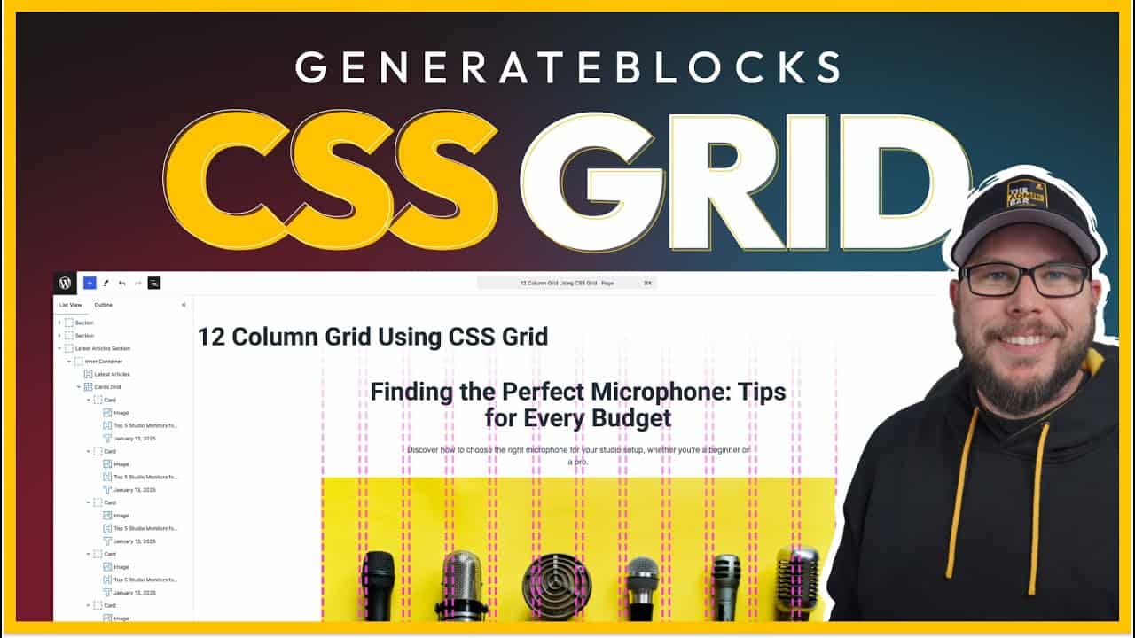
While the 12-column grid is a great visual example, it’s not always the most practical approach. Let’s look at a more applicable use case: creating a grid for blog post cards.
Step 1: Set Up the Section
Start with a section containing:
- A headline (e.g., “Latest Articles”).
- A wrapper for the blog post cards.
Step 2: Create the Grid
- Select the wrapper and change its display property to
grid. - Use the 3-column grid preset: repeat(3, minmax(0, 1fr))
This creates three evenly spaced columns.
- Add a column gap of 16 pixels for spacing between the cards.
Step 3: Add Blog Post Cards
Each card contains:
- A featured image.
- A title.
- A date.
Duplicate the cards to fill the grid.
Adjusting Card Layout
If you want one card to span multiple columns:
- Select the card and set its grid column property.
- For example, to span two columns: span 2
This makes the card twice as wide as the others.
- Alternatively, specify exact start and end points: 2 / 4
This starts the card at column 2 and spans to column 4.
Why CSS Grid Is Ideal for This Layout
CSS Grid simplifies layouts where the parent container controls the structure. Unlike Flexbox, which relies on child elements for alignment, CSS Grid allows you to define the layout at the parent level.
For example:
- If you change the grid to 4 columns, all cards automatically adjust to fit the new layout.
- Adding or removing cards doesn’t require additional styling—they’ll automatically fill the grid.
Wrapping Up
CSS Grid is a powerful tool for creating both simple and complex layouts. Whether you’re replicating a 12-column grid from Figma or building a responsive blog post grid, CSS Grid offers flexibility and control that other layout methods can’t match.
For practical use cases, like blog post grids, CSS Grid shines by allowing you to easily adjust the layout and span elements across multiple columns.
If you’re new to CSS Grid, start with simple layouts like the ones shown here, and gradually explore more advanced features like overlapping elements. With practice, you’ll find CSS Grid to be an indispensable tool in your design workflow.
Kyle Van Deusen
After spending 15 years as a graphic designer and earning a business degree, I launched my agency, OGAL Web Design, in 2017. A year later, after finding the amazing community around WordPress, I co-found The Admin Bar, which has grown to become the #1 community for WordPress professionals. I'm a husband and proud father of three, and a resident of the Commonwealth of Virginia.