Forms are one of the most important parts of a website to get right from an accessibility perspective because forms are a big way that we measure the success of a website.
Forms are also an area where we see a lot of accessibility problems, especially in WordPress. This Accessibility Weekly post is all about common accessibility errors in forms and how to fix them.
Top Accessibility Errors in Forms on WordPress Websites
Here are the most common accessibility problems that we encounter at Equalize Digital when we’re auditing websites.
Unlabeled Fields
As discussed in my “Labels, Not Placeholder Text” article, all fields need a visible label that is properly attached to the field and stays visible when you type in it.
Missing or empty field labels are an accessibility problem that can be easily identified with an automated accessibility scanning tool like Accessibility Checker. You can also identify this by inspecting the HTML to ensure all visible labels are connected to their respective fields with a “for” attribute.
How to Fix Unlabeled Fields
If you find unlabeled fields on a form built with a form plugin in a WordPress website, first check to see if a user just turned on a setting to hide visible labels or failed to fill in the label in the form settings. It’s possible that the issue may be due to a misconfiguration, and adjusting the settings within the plugin’s interface will resolve the problem.
If you’ve confirmed that the issue can’t be resolved through plugin settings and the missing label isn’t on something you built, the best option is to contact the plugin developer and ask them to release an update that corrects the problem.
As a last resort, if you’re comfortable with JavaScript and cannot get assistance from the developer, you can use JavaScript to add the label or missing “for” attribute programmatically. This should be considered a temporary fix, as it could be affected by future updates to the plugin.
Missing Fieldsets
Another problem common to many WordPress form plugins or plugins with forms is that they fail to use the <fieldset> HTML tag to group related form controls such as radio buttons and checkboxes. In these field types, each input has its own label, and there is a legend above them that adds additional context to the input’s label.
Here’s an example of this in HTML:
<fieldset>
    <legend>Do you want to subscribe to our email list?</legend>
    <label>
      <input type="radio" name="subscribe" value="yes" />
      Yes, subscribe me!
    </label>
    <label>
      <input type="radio" name="subscribe" value="no" />
      No, thanks.
    </label>
</fieldset>
Fieldset elements provide semantic structure to a form, allowing assistive technologies like screen readers to understand the relationships and grouping of form controls. Without these groupings, the form’s structure and organization can become unclear to people who are blind or are hearing the form on a screen reader.
In an automated scanning tool like Accessibility Checker, you might see missing fieldsets flagged as duplicate form labels. Several popular WordPress form plugins incorrectly attach the question to the first input, which results in that input having duplicate labels.
How to Fix Missing Fieldsets
If a form on your website is missing <fieldset> and <legend> tags, you typically need to request a fix from the plugin developer or correct it with JavaScript.
Some form plugins have more up-to-date markups that can be toggled on in their settings that will add these tags, whereas previously, they were missing.
In Gravity Forms, for example, you want to make sure you have legacy markup turned off in the form settings for any forms that were created before their version 2.5.
In WP Forms, older websites need to go to the general settings for the plugin and enable modern markup.
Other form plugins working to improve accessibility may have similar settings that will resolve missing fieldset errors.
Misuse or Overuse of Placeholders
Placeholders in HTML input elements are intended to provide a brief, non-obtrusive hint or example of the expected input for users. They are not intended to name the field.
So, for example, it is incorrect to set the words “email address” as a placeholder for an email field. The correct placeholder for this would be “[email protected],” except that none of us need a placeholder for an email field because we all know how to format an email address.
Excessive use of placeholder text can be noisy to screen reader users and slow them down as they complete a form. When testing forms, ensure that placeholder text is only used when necessary, such as conveying the expected format of a date that could be typed multiple ways.
How to Fix Bad Placeholder Text
If you can’t remove incorrect or unnecessary placeholder text in the form settings and can’t wait for the plugin developer to release a fix, removing placeholder text is relatively easy with JavaScript.
Assume you had this email field:
<label for="field-1-234">Email Address:</label>
<input type="email" id="field-1-234" placeholder="[email protected]">
In JavaScript, you can select the input field by its ID:
var emailInput = document.getElementById('field-1-234');
Then, empty out the placeholder attribute like this:
emailInput.placeholder = '';
Missing Required Indicators
To indicate that a field is required in an HTML form, you can use the “required” attribute. When a field has the required attribute, the user must fill in that field before submitting the form. If a required field is left empty, the browser will prevent form submission and typically display an error message to the user.
Common accessibility mistakes we see around required fields are:
- The form creator forgot to mark the field as required, and so it’s missing the attribute completely.
- The required attribute is present, but there’s no visible indicator that the field is required.
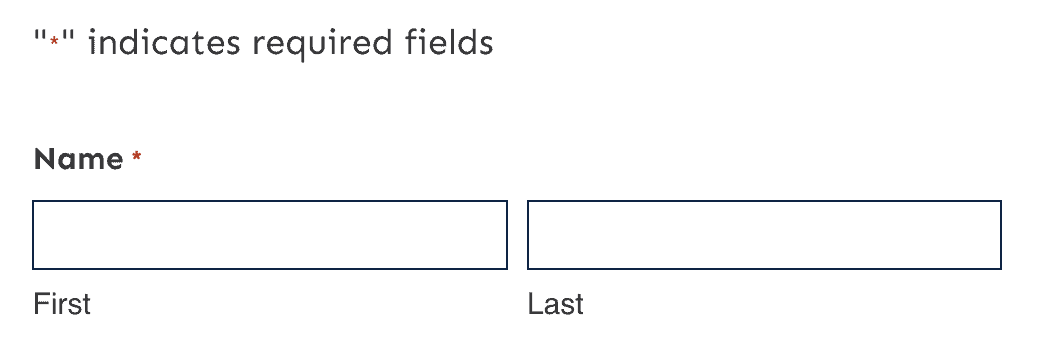
- The only visible indicator for required fields is an asterisk (*), and there’s no key telling users what the asterisk means.
How to Fix Missing Required Indicators
The best way to indicate that a field is required is with visible text next to the field label that says “required.” This allows sighted people to know that they are required to fill the field in and doesn’t make someone have to interpret the asterisk.

If you prefer the slimmer look of an asterisk, you need to add a key above the field that explains what the asterisk means.
Failure to Communicate Error and Success Messages
After unlabeled fields, failure to effectively communicate error and success messages is one of the most significant accessibility errors that will stop users from being able to submit forms. Error and success messages, when not implemented correctly, can cause confusion and frustration for all users.
Just recently, I tried to submit a form multiple times on my phone, thinking it was broken because it didn’t scroll me up to the error message. Most of us have probably had a similar experience, and error and success messages not announced to screen reader users are widespread.
How to Fix Form Messages
Web forms must provide well-structured, clear, and accessible error and success messages to users on all devices. These messages should be available in both visual and auditory formats, ensuring that all users can effectively interact with the form.
Test your forms with a screen reader like NVDA for Windows or VoiceOver for Mac. Intentionally skip required information or incorrectly format text in an input, submit your form, and then make sure your error messages:
- Have good color contrast and are visually distinct (red is common here).
- Have meaningful text that explains how to fix the error.
- Are read out by a screen reader.
If the error is above the viewport or keyboard focus, the page should reload or the user (and their keyboard focus) should be moved to the top of the form. There should be an error message at the top of the form summarizing all errors and a message for each field. Ideally the message above the form allows users to jump down to the first field with and error.
Success messages should, likewise, be communicated to both screen reader users and to sighted people. You can use ARIA alerts to do trigger screen readers to read out triggered messages. Another great way to ensure everyone is aware that a form submitted successfully is to send them to a different page completely with a title like “Thank You” or “Success.”
Other Best Practices
Other best practices for forms include:
- Ensuring that labels are positioned close to the field they’re for.
- Having a field border that contrasts with the background and goes all the way around the field (no underlines only).
- Ensuring all text (labels and input text) has AAA color contrast.
- Adding autocomplete attributes to inputs.
- Providing clear and helpful instructions.
- Paginating long forms or using conditional logic to hide irrelevant fields so that fewer fields are visible at a time.
- Providing a confirmation page that allows people to confirm the information they provided before they hit submit (this is especially important for forms with payment fields).
- Don’t impose a time limit on a form. If one is necessary, such as for security considerations, users should be given the choice to either disable it or request an extension.
As a final thought, beware of “fancy” inputs like drag and drop form fields, multiselects or toggle buttons. Many of these non-standard inputs may be completely in accessible to people who cannot use a mouse.
Always test the forms you build with a keyboard and screen reader to make sure they can be used by everyone.
Join the Conversation!
There's a dedicated thread on this post inside of The Admin Bar community. Join in on the conversation, ask questions, and learn more!
Group Thread

