Of the many facets of web design, color can be one of the hardest to feel like you have a good grasp on. It’s both an art and science, which can be frustrating for the more “development-minded” folks who don’t have an natural eye for design.
And while clever developers have created very robust frameworks that use particular color spaces and complicated math — in practical terms, I find they’re often overkill in the types projects I’m working on.
Over the years I’ve slowly developed my own framework that works great as a starting place, and is often all I need. Now that I have that dialed in and ran through its paces on dozens of projects, I thought I’d share my system.
If you could use a simple, reliable, and practical color palette for your website projects, then stick around and let’s get started!
Learn better by watching? Check out this article in video form!

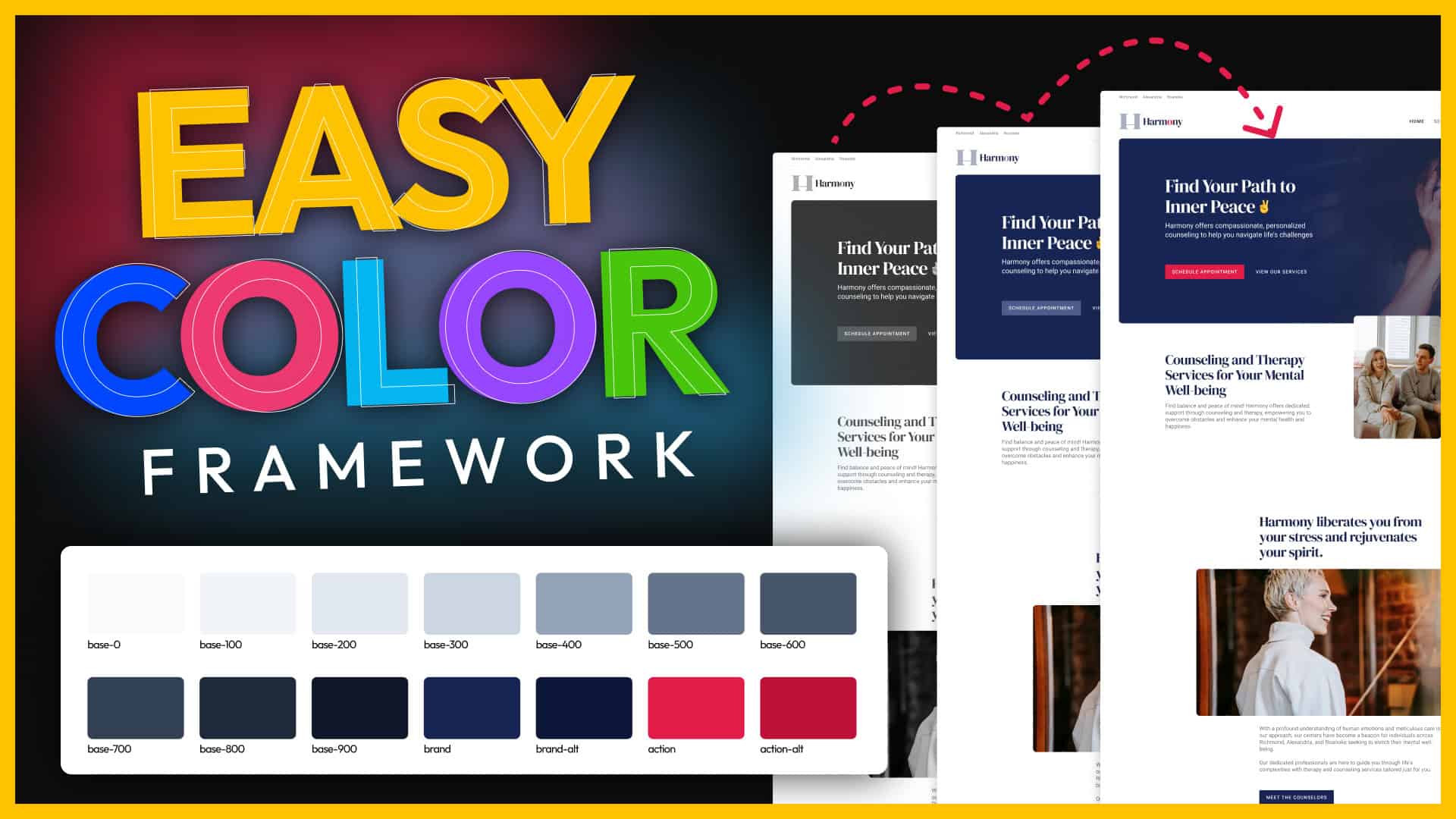
The Color Framework
The idea of this framework is to make it flexible enough to fit in nicely with most brands, portable so that colors can be easily swapped, and robust enough to achieve a considered and polished look.
To accomplish that, first, I take advantage of Custom Properties (sometimes referred to as “CSS variables”) that allow me to reuse this framework with any brand without having to change the naming convention. Custom properties act as a placeholder name for your color values and give you an easy-to-remember name instead of a random HEX value.
If you need to brush up on custom properties, I do have a video dedicated to the subject on YouTube.
Second, I loosely follow the 60-30-10 rule — design principle creates visual balance and harmony by proportionately distributing colors to prevent overwhelming the viewer. This means my palette has 3 distinct families within it; Base (60%), Brand (30%), and Action (10%).
Let’s take a closer look at each of those, and how the palettes are filled out.
Base Color
The Base family within my color palette ends up being the most robust since it ends up occupying about 60% of the design. It’s used for things like backgrounds, text, shadows, and subtle design accents, and typically consists of a range of neutral colors.

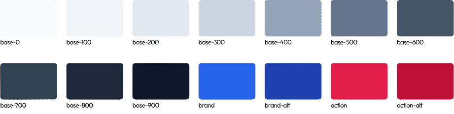
To make this system portable into every project, I use a naming convention that starts with the word “base”, followed by a dash, and then a numeric value starting at 0 (for pure white) and ending at 900 (for my darkest color) incrementing by 100 between each step.
That ends up looking like this:
—-base-0—-base-100—-base-200—-base-300- …
—-base-900
Incrementing by 100 follows the same convention of font weights (like we’re used to with 100, 400, 600, etc.) and gives us the ability to fit in in-between numbers where necessary (like 250 for a shade slightly darker than 200, but not quite as dark as 300).
As for color values for all of my base colors, these should be neutral, but will often tint them either slightly cool or warm based on the company’s branding.
Now that can sound really complicated, but I’m not try to reinvent the wheel here…
Tailwind has an awesome color palette (that already follows a similar numbering convention for colors) with 5 neutral palettes; stone, neutral, zinc, gray, and slate (listed from warmest to coolest).
My only tweak to the Tailwind palettes is that I’ll add a “—-base-0” as a pure white, and rarely incorporate their 950 color.
If you’ve not worked with color palettes like this before, you may be surprised to see so many variations of what is essentially gray — but having multiple tints and shades of your base color can come in handy and gives designs a much more polished look.
In the physical world, we might only use one paint color on our walls, but light sources and shadows give us an infinite number of tints & shades, and having at least a few variations in our palette makes things feel more natural and realistic.
Here’s an idea of how I end up using them most often:
—-base-0is used for the backgrounds of cards or anything I want to give the illusion is sitting “on top of” my primary background.—-base-100is the primary background color throughout my site, and is typically just slightly darker than white (or lighter than black, but we’ll tackle dark mode later in this article).—-base-200is used for subtle accents and some shadows—-base-300is most often my border colors—-base-600is often for light text—-base-700is my body text—-base-800is typically my headlines- and
—-base-900is reserved for dark section backgrounds or when I need slightly more contrast in text.
That’s not to say those colors never get used for anything else — they do — but that should give you a good starting place.
You may have noticed I skipped —-base-400 and —-base-500. I find that the mid-tone colors can be the most difficult to work with and the least pleasing to the eye. Even though I use these the least out of my base palette, I tend to include them anyway. If for nothing else, just to keep the naming convention in tact and easily understandable.
Brand
If you’re feeling a bit overwhelmed — after all, I did promise something more simple and practical — don’t worry, we’re over the most complicated part and it gets a lot easier from here forward.
That starts with the primary brand color — which I’ll often just call “Brand”.
Some companies might just have one brand color (besides anything you might consider “neutral”), which makes choosing your brand color simple. But if the business you’re designing for has two colors (let’s say blue and red), then there is usually one that’s used more prominently over the other, which I’ll use here as the “Brand” color.

Unlike the base palette, which has a large number shades/tints, I tend to only need two variations in the brand family.
First is the brand color itself (which I call —-brand), alongside an either darker or lighter version of the brand color that I can use for interactions (like a “hover color”). I’ll usually call this —-brand-alt as there isn’t enough colors to make the 0 to 900 naming convention useful.
At times I’ll find situations where I need more shades of the brand color (which you can get with a tint/shade generator and use the ‘incrementing by 100’ naming convention), but more often than not, I find myself preferring the Base family for those kinds of accents.
For our brand color, we’re wanting to use this for approximately 30% of the design. With backgrounds and text already taken care of with the Base colors, I use Brand colors for things like icons, links, buttons, and call-to-action backgrounds. At times I might use the Brand color from headlines, though too much colored text can be a bit obnoxious.
Action
Last in my palette is the Action color, which is used most sparingly (it’s our 10% in the 60-30-10 principle), and not at all if the company branding only has one color.
Like the brand color, I like to have two variations of my Action color (—-action and —-action-alt) to cover me if I need a slight variation of the action color for hover states or other interactions.

As for it’s use, I use it as sparingly as possible, saving it almost exclusively for the primary call to action on a page.
Since I tend to use the brightest color for the action color and it’s used sparingly, it can really stand out in a design and draw the users eye — which is perfect for a call to action, so long as you don’t overuse it.
Practical Applications and Examples
When it’s all done, the palette will look something like this:
Next, let’s take a practical look at what these palettes look like in action and I’ll wrap things up by sharing tips for accessibility and how you can adapt this framework for dark mode sites.
Color Palette In Action
In this first design, we can see the brand has 2 colors; blue and pink.

The base colors are used for the background, subtle design accents, and text.
The Brand color is used for the hero background, the ‘current page’ indicator in the navigation menu, and the H2 headline in the second section.
The Action color was only used as the background of the primary CTA button prompting users to “schedule an appointment”. Because if it’s bright contrast and tasteful sparse use, your eyes are drawn to those areas of the page, which is a great use of the action color.
On this site, however, we just have 1 brand color (blue), so we’ve dropped the action color:

Again the base colors are handling the text and backgrounds, but here the brand color is featured more prominently as a highlight and the call to action color.
This can still look great — and is arguably more common in most designs you see — but it can make it slightly more difficult to direct the viewers eye. Because of that, I tend to prefer a brand and action color anytime it works with the branding. And, unless is strictly prohibited by their brand guidelines, I will often pick a complimentary color to use as an action color for brands that just have 1 color.
Adapting to Dark Mode
One of the really neat things about this palette is that it really easily adapts to dark mode.
You could simply use the darker base colors (700, 800, 900) as the backgrounds on your site, and the light colors (100, 200, 300) as the text colors — but what I prefer is reversing the palette.
What I mean is that —-base-100 becomes my darkest color, and —-base-900 becomes my lightest. This way I can still assign these colors to the same defaults (like —-base-100 as my site background) in my child theme, but end up with a dark theme instead.
The naming convention means that you can easily create a dark/light theme variation by just reversing the order of the colors.
Ensuring Accessibility
Make sure when you’re building out your color palette you’re checking color contrast to make sure your palette is accessible to WCAG AA standards (at a minimum).
There are two sites I keep bookmarked to help me with this:
- Learnui.design’s accessible contrast color tool is one of my favorites because not only will it give you a pass/fail for both AA and AAA guidelines, but it will suggest tints/shades that would pass if yours don’t.
- An accessible color matrix will show you which colors can be used in combination — so you can easily make guidelines on which color text belongs on each background color in your palette.
Blending Art & Science
In the end, how you use color is just as (if not more) important than the colors themselves.
This framework is helpful in applying the 60-30-10 rule, keeps your decision making to a minimum, and easy easily portable into any project.
However, it’s important to remember there is no one palette that works for every project. In my experience, you’ll almost always need to make tweaks (sometimes small, other times large) on a project-by-project basis — and that’s okay.
As you experiment more you can always make adjustments that better suit your philosophy and the types of projects you work on.
Kyle Van Deusen
After spending 15 years as a graphic designer and earning a business degree, I launched my agency, OGAL Web Design, in 2017. A year later, after finding the amazing community around WordPress, I co-found The Admin Bar, which has grown to become the #1 community for WordPress professionals. I'm a husband and proud father of three, and a resident of the Commonwealth of Virginia.