The difference between a good design and a great design often lies in the details. It’s not always about making grandiose changes; sometimes, it’s the subtle tweaks that can transform your design from ordinary to exceptional.
In this post, I’m going to walk you through five simple yet impactful design rules that can make a huge difference in your web designs. These tweaks are easy to implement and can instantly elevate the look and feel of your projects.
By the end of this post, you’ll have a clear understanding of how these small adjustments can lead to significant improvements in your design work.
So, whether you’re a seasoned designer looking to refine your skills or a beginner eager to learn some quick wins, stick around.
Learn better by watching? Check out this article in video form!
1. Optimizing Button Padding for Visual Appeal
Button padding might seem like a minor detail, but it plays a crucial role in the overall aesthetics and functionality of your design. And since you’re going to be using buttons all across your website, it’s one of those things you want to make sure you get right.
As designers, we tend to want to do a lot of even spacing around elements. And while that makes since in most cases, that doesn’t really apply well to buttons.
If you give a button equal vertical and horizontal padding, it can make them look stubby and unbalanced to the point they look like they would fall over backwards if you just barely touched them.

And forget adding rounded corners — now it looks all out of wack!

One effective approach is to double the padding on the left and right sides compared to the top and bottom. This creates a more balanced and stable look.
For instance, if you have 15 pixels of padding on the top and bottom, try increasing the left and right padding to 30 pixels. This slight adjustment can make the button appear more grounded and visually pleasing.
Look at the two versions, the original and our improved version side-by-side.

My version, with the wider width not only looks more stable, but it can also better accommodate rounded corners or even pill shapes.
Using EM Units for Scalable Design
While we’re here, I should mention that I like to use EM units instead of fixed pixel values for padding. EM units are relative to the font size, ensuring that your button maintains proportionate padding regardless of text size. This is particularly useful if you need to create variations of your buttons, like “large” or “small”.
For example, set your button’s top and bottom padding to 1 EM and the left and right padding to 2 EM. When you change the font size, the padding will automatically adjust, keeping the button’s proportions intact.
2. Effective Use of Uppercase Text
Uppercase text, often used for pre-headings (or “eyebrow text”), or category labels on blog cards, can add emphasis and a clean look to your design. However, if you’re not careful, uppercase text can make your content much harder to read.
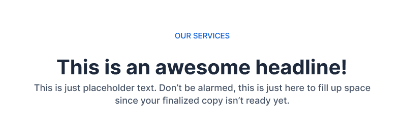
To improve legibility, I recommend adding letter spacing anytime you’re using small, all uppercase text.
Adding .05em to .1em, which will, again, scale proportionately, can make a noticeable difference.
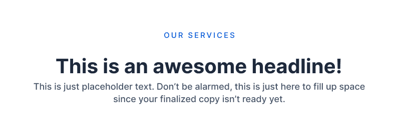
If you glance back and forth at these two options — one with letter spacing and one without — it actually starts to look like the version without letter spacing has negative space, like it’s too cramped.
Because capital letters all occupy the same height, the extra space between the letters gives the word a little bit more room to breathe and makes things easier on your eyes.
It’s important to note that this suggestion doesn’t apply to large font sizes in the same way. In fact, big headlines can often benefit from a little negative letter spacing.
Make Sure to Use Text-Transform
It’s important when you use all uppercase lines to not actually type them out in uppercase. This can create issues where screen readers read things out letter-by-letter (though they’ve gotten better about that), and limits your flexibility to change text styles later.
Instead, type your text normally, and use CSS to transform your text to uppercase.
3. Avoiding Pure Black and Pure White
Pure black (like hex code #000000) and pure white (#ffffff) creates an extreme contrast that can be hard on your eyes, making your content tiring to read.

And by using these extreme values, you box yourself into a situation where you can’t use shadows (on things that are already pure black) or highlights (on things that are pure white).
Think of it like this; screaming is great for getting someone’s attention, but if you screamed all the time, it would lose its effect.
Instead, choose a slightly lighter than black shade for your darkest color, and an extremely light gray for the lightest color in your palette.

Even subtle changes, like #121212 for black and #fafafa for light, can make a huge improvement on the readability of your content, and still register as “black” and “white” to anyone looking at your design.
Adding a Tint of Color
If you want to take your neutral colors to the next level, considering adding a slight hint of color to them. A slightly cool black can make your designs feel more modern and sleek, while a warm tint can create a more inviting atmosphere — let your company’s branding be your guide as to which way you go.

You don’t have to overdo it here — you want it to still pass for black and white — just a slight tinge of color can go a long way in making your entire design feel more cohesive.
4. Creating Visual Hierarchy with Background Colors
Understanding how to create a visual hierarchy is crucial for effective design, and one simple way to do this is by using background colors to differentiate elements.
One way you can achieve hierarchy — especially giving the illusion that something is closer to the viewer or further way — is by making elements closer to the viewer appear lighter than those farther away.
Take this section with a 3-column card design for example.
In the first version, the cards (which sit “on top” of the background) are darker than the background they sit on.

You might not think much of it until you see this example where I’ve reversed those colors:

The second version looks a bit more natural when you compare the two. And even though I wouldn’t call the first version “wrong”, I do think that the second version just feels quite a bit better even if you didn’t understand the reason behind it.
This, by the way, works the same in both light and dark mode designs.
Think in “Levels of Surfaces”
Of the tips I’ve shared so far, this one can be taken to the extreme most easily. If you took this rule literally and applied it to every element on your website you might run out of colors!
Instead, think of your website having 2-4 “levels” of surfaces.
Things on a single surface — like the image, text, and button on a card — can all exist on the same plane can have a mix of lighter and darker elements.
Use this tip sparingly and apply it only when you want to emphasize hierarchy and make something look as if it’s on “top” of something else.
Simplifying Font Weights for Clarity
When it comes to typography, using too many font weights can clutter up your design. While it may seem like it adds variety, simplifying your font weights not only makes your design look better, it helps give you a system for when you use different weight (which can carry a subconscious meaning).
If you look at this example, you’ll see we’re using 400 for our body copy, which is pretty typical. But we’re using 300 weight for our light text, and 500 for our bold text.
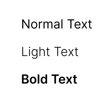
Because these 3 weights are so close to one another, it can make them really hard to differentiate.
A more effective approach is to skip font weights, which creates a clear contrast between different weights. For instance, instead of using 300, 400, and 500 — try using 200 for light text, 400 for regular text, and 600 for bold text.
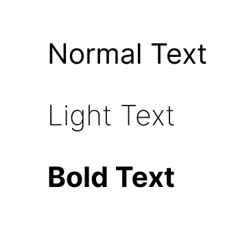
This will help tidy up your designs and give your font weights more meaning.
Big bold fonts have lots of contrast, and therefore typically give the impression they are more important.
Thin fonts have less contrast and give the impression they are less important.
Less Fonts, More Speed!
Using less font weights has a side-benefit as well — it will make your website even faster!
Some builders will try to load in every possible weight of your font, and even when you don’t use them, you might still be serving them to your visitors every time they load your page.
By simplifying things, and only using the font weights you really need, you’ll enjoy a prettier and faster website.
Putting It All Together
Now that we’ve covered these five impactful design tweaks, let’s put them to the test. We’ll apply each principle to a sample card design to see how these small adjustments can lead to a significant improvement.
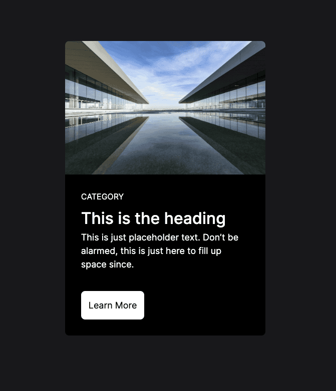
Original Card Design
Here’s our starting point, a basic card design with some text, a button, and a category label. It’s functional, but there’s plenty of room for improvement.
Step 1: Optimizing Button Padding
First, we’ll adjust the button padding. By increasing the horizontal padding to twice the vertical padding, we create a more balanced and visually appealing button.

Step 2: Adding Letter Spacing to Uppercase Text
Next, we’ll add some letter spacing to the uppercase category label to improve readability.

Step 3 & 4: Avoiding Pure Black and Pure White & Creating Visual Hierarchy with Background Colors
We’ll then adjust the background and text colors to avoid using pure black and pure white. This makes the content easier on the eyes and adds a subtle sophistication to the design.
To enhance the visual hierarchy, we’ll adjust the background colors, making the card slightly lighter than the background it sits on.

Step 5: Simplifying Font Weights for Clarity
Finally, we’ll simplify the font weights to create a clearer contrast and tidy up the typography.

Final Enhanced Card Design
Here’s the final result after applying all five tweaks. Compare it with the original, and you’ll notice how these small adjustments have transformed the design into something much more professional and visually appealing.
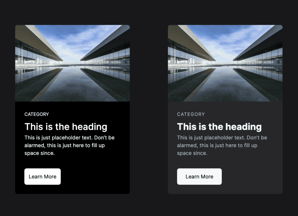
By following these five simple rules, you can significantly improve your web designs, making them not only more attractive but also more functional and user-friendly. Remember, design is all about the details, and these tweaks can help you achieve that polished, professional look.


