One of my favorite things to design is blog article layouts. Whenever I read a blog, I pay close attention to how the content is structured and styled. Recently, I came across an article on The Verge and was impressed by how they use images and media to pop out of the text container. It’s a subtle yet effective design choice that makes the layout look polished and professional.
I’ve tried achieving this effect with Flexbox in the past, but it can be cumbersome to set up. So, I decided to tackle it using CSS Grid. While CSS Grid isn’t natively supported in GenerateBlocks yet, we can write some simple CSS to achieve this look in just a few minutes.
If you’re interested in learning how to create this type of layout, let’s dive in!

Setting Up the Blog Post
To start, we’ll work within GeneratePress Elements and edit the single post blog element.
Adding the Post Content
- Open the single post blog element and set up the hero section. This includes the page title, excerpt, author information, and featured image.
- Below the hero section, add a new section for the post content.
I use a shortcut in TextExpander to quickly create a container with an inner container that includes my default settings. This saves time and ensures consistency across sections.
- Add a Dynamic Content Block to the new section and set it to display the post content.
- Update the element and refresh the front end of your website. You should now see the blog post content displayed.
Adding a Class
To style the post content, we need to add a class to the container.
- Select the container for the post content and add a class, such as
blog-content-wrapper. - Update the element and refresh the front end.
Now we’re ready to jump into the customizer and start writing CSS.
Setting Up CSS Grid
We’ll write our CSS in the Additional CSS section of the customizer.
Targeting the Content
To ensure we only affect the blog post layout, we’ll explicitly target the blog-content-wrapper class.
- Start by targeting the dynamic content block, which has the default class
dynamic-entry-content. - Add a temporary outline to confirm you’re targeting the correct element:
css
.blog-content-wrapper .dynamic-entry-content {
  outline: 1px solid red;
}
Once confirmed, we’ll set the display property to grid:
css
.blog-content-wrapper .dynamic-entry-content {
  display: grid;
}
Defining Grid Columns
Next, we’ll define the grid structure.
- Use
grid-template-columnsto create three columns:- A small left column (
1fr) - A middle column for the content (
65ch) - A small right column (
1fr)
- A small left column (
css
.blog-content-wrapper .dynamic-entry-content {
  display: grid;
  grid-template-columns: 1fr 65ch 1fr;
}
This creates a balanced layout with a readable content width in the middle column.
- Add a column gap to create spacing between the columns:
css
.blog-content-wrapper .dynamic-entry-content {
  column-gap: 40px;
}
Fixing Child Elements
By default, setting display: grid makes all child elements grid items, which can cause layout issues. To fix this, we’ll ensure all content stays within the middle column:
css
.blog-content-wrapper .dynamic-entry-content * {
  grid-column: 2 / 3;
}
This places all child elements (e.g., paragraphs) within the middle column.
Styling Images
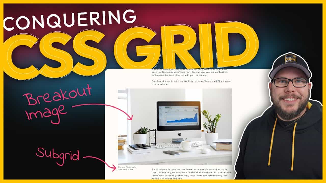
To make images pop out of the container, we’ll adjust their grid placement.
- Target the image block (e.g.,
gb-block-imagefor GenerateBlocks):
css
.blog-content-wrapper .dynamic-entry-content .gb-block-image {
  grid-column: 1 / 3;
}
This spans the image across the left and middle columns, creating the desired breakout effect.
Styling Captions
For a more polished look, we’ll move the image caption to the left column.
- Use Subgrid to make the image itself a grid:
css
.blog-content-wrapper .dynamic-entry-content .gb-block-image {
  display: grid;
  grid-template-columns: subgrid;
}
- Target the caption (
figcaption) and place it in the left column:
css
.blog-content-wrapper .dynamic-entry-content .gb-block-image figcaption {
  grid-column: 1 / 2;
}
- To prevent the caption from affecting the flow of content, position it absolutely:
css
.blog-content-wrapper .dynamic-entry-content .gb-block-image figcaption {
  position: absolute;
  top: calc(100% + 24px);
  font-size: 0.8rem;
}
This positions the caption below the image with a small gap and ensures it doesn’t push other content down.
Making the Layout Responsive
To ensure the layout works on smaller screens, we’ll use media queries.
Desktop Layout
Wrap all the CSS inside a media query targeting desktop screens:
css
@media (min-width: 1025px) {
  /* All CSS for desktop layout */
}
Tablet and Mobile Layout
For smaller screens, we’ll revert to a simpler stacked layout:
css
@media (max-width: 1024px) {
  .blog-content-wrapper {
    max-width: 65ch;
  }
}
This ensures the content aligns with the hero section and stacks naturally on smaller devices.
Wrapping Up
This CSS Grid solution allows images and captions to break out of the text container automatically, without requiring manual adjustments. Writers can simply add images and captions as usual, and the layout will handle everything for them.
While there are other ways to achieve this effect—such as adding specific classes to images—this approach is fully automated and works seamlessly with dynamic content.
If you’re new to CSS Grid, this tutorial might feel a bit overwhelming. I recommend checking out additional resources to learn more about CSS Grid’s capabilities. It’s a powerful tool that offers significant advantages over Flexbox for layouts like this.
Although CSS Grid isn’t natively supported in GenerateBlocks yet, it’s starting to appear in other builders like Elementor. I wouldn’t be surprised if it eventually comes to GenerateBlocks as well. By learning CSS Grid now, you’ll be ready to take full advantage of it when it’s integrated into your favorite tools.
Happy designing!
Kyle Van Deusen
After spending 15 years as a graphic designer and earning a business degree, I launched my agency, OGAL Web Design, in 2017. A year later, after finding the amazing community around WordPress, I co-found The Admin Bar, which has grown to become the #1 community for WordPress professionals. I'm a husband and proud father of three, and a resident of the Commonwealth of Virginia.