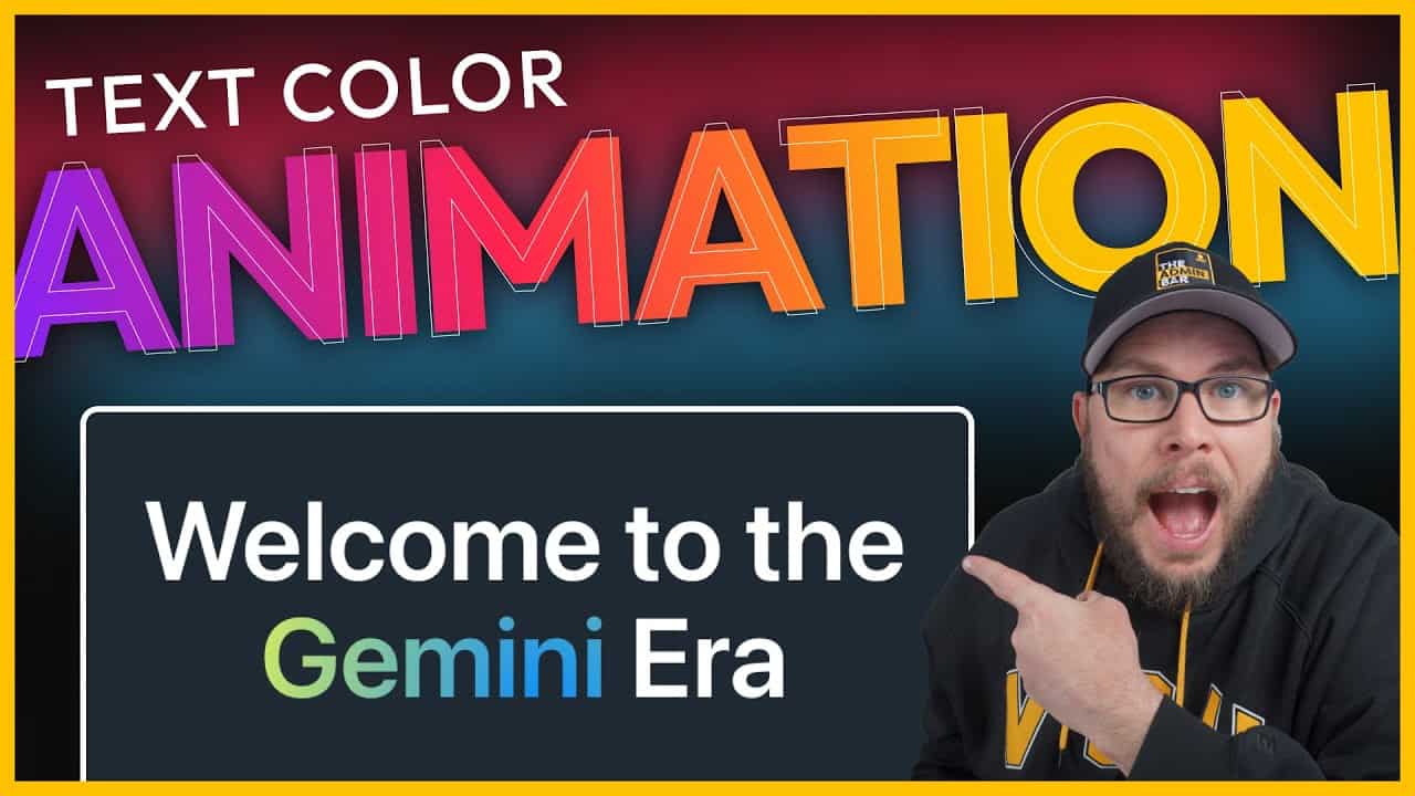
Recently, I’ve been exploring animations, and one effect caught my attention: the animated background text featured on Google’s Gemini landing page. Google’s implementation is quite complex, using an image to mask the text. I wanted to see if I could replicate a similar effect—about 90–95% of the look—but with far less code.
In this guide, I’ll show you how to create animated background gradient text using just a few lines of CSS. It’s a subtle yet eye-catching way to add animation to your website without going overboard.
Setting Up the Basics
To start, I’ve created a simple section with an inner container. The container has a reduced max width to keep the text condensed, and I’ve applied a dark background to make the text stand out.
Next, I added an H1 element with the text “Welcome to the Gemini Era.” To make it visible, I set the text color to white and center-aligned it. I also applied a global style to make the headline larger.
Highlighting a Single Word
To apply the animated effect to just one word in the headline, I wrapped the word “Gemini” in a <span> element with a custom class. Here’s how you can do it:
- Click on the headline and select Edit as HTML.
- Locate the word you want to animate (in this case, “Gemini”).
- Wrap the word in a
<span>tag with a class name, like this:
html
<span class="gemini">Gemini</span>
- Close the HTML editor and return to the visual editor. If everything is done correctly, the text should look the same as before.
Adding CSS
Now that the HTML is set up, it’s time to write the CSS. Open your site’s customizer and navigate to Additional CSS.
Step 1: Create the Gradient Background
First, target the .gemini class and define a radial gradient for the background. For this example, I used dodger blue and yellow, but you can customize the colors to match your brand.
css
.gemini {
  background: radial-gradient(circle, dodgerblue, yellow);
}
To make the gradient animate smoothly, increase the background size:
css
background-size: 200% 200%;
Step 2: Write the Animation
Next, create a keyframe animation to move the gradient across the text.
css
@keyframes gemini {
  0% {
    background-position: 0% 0%;
  }
  50% {
    background-position: 100% 100%;
  }
  100% {
    background-position: 0% 0%;
  }
}
Apply the animation to the .gemini class:
css
.gemini {
  animation: gemini 15s linear infinite;
}
Step 3: Clip the Background to the Text
To make the gradient appear within the text, use the background-clip property:
css
  background-clip: text;
  color: transparent;
This clips the gradient to the text and makes the text color transparent, allowing the background to show through.
Adjusting the Animation
At this point, the animation is functional, but the speed may feel too fast. Slowing it down to 15 seconds creates a more subtle effect, which is ideal for most designs.
Wrapping Up
While this approach doesn’t replicate Google’s Gemini effect exactly, it achieves a similar look with far less code. The result is a clean, subtle animation that works well across browsers and won’t impact your website’s performance.
This method is perfect for adding a touch of animation to your site without overwhelming your design. Give it a try, and feel free to experiment with different colors, speeds, and gradients to make it your own!
Kyle Van Deusen
After spending 15 years as a graphic designer and earning a business degree, I launched my agency, OGAL Web Design, in 2017. A year later, after finding the amazing community around WordPress, I co-found The Admin Bar, which has grown to become the #1 community for WordPress professionals. I'm a husband and proud father of three, and a resident of the Commonwealth of Virginia.